
a collection of notes on areas of personal interest
Why are posters so popular?
Posters and flyers are used as a relatively inexpensive way of placing information in a position for it to be readily seen. Some of the best artists have produced memorable posters, posters which are bought and adorn walls all over the world. Some are iconic. They have become a relatively inexpensive way of purchasing art for display if not for study as well as collectable items, some of which have become extremely valuable.
My favourite designers tend to be of the older generations, people such as Saul Bass, but I am particularly attracted to the work of Polish designers as they seem to be extremely inventive, although there are a number of other parts of Europe where graphic designers have developed considerably powerful posters.
Posters are used to attract attention, entice reading, deliver a message and encourage people to learn something, hopefully to their advantage.
Style
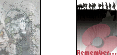
Here there are two markedly contrasting styles. That on the left has a quasi-religious, contemplative nature and is intended either for a slow-moving viewer passing close and in a position to take the time to read it, or somebody sitting and reading it at their leisure. The text is arranged vertically in order to force the viewer to take the time to read it. In retrospect, and looking at the reduced image on this page, I think the lettering could be more powerful and would have to be carefully balanced with regard to the strength of the imagery behind it.
The poster on the right was intended to shout at the viewer. It was designed in black, white and red to reflect the bloodshed of the First World War, and only has to hint at soldiers on the skyline with a single word ’Remember’ – located as far away as possible from the skyline in order to force the viewer’s eye to move constantly from one to the other – to make the association for Remembrance Day across the image of the Remembrance Day poppy.
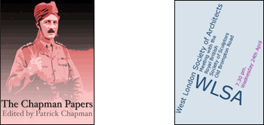
The near image to the right is strictly not a poster, though it could be adapted as one. It was designed as the cover for a book of papers relating to the genealogy of a particular family. The illustration, developed from a family photograph of an officer in the Indian Army of the First World War, was selected for its unusual style of dress, while the colours were simplified to reinforce the strength of the image. A serifed font was used to give a feeling of gravity to the design, which might be compared with the design to the right.
The image to the right is a mock-up for simple clear, professional announcement. It gives the most basic of details – and nothing else. In many ways it is boring and unattractive but it reflects a style which was popular many years ago in graphic design and has returned in some professional circles. An appropriate image as a background, or a visual device, might make this poster more attractive, but would probably detract from the message contained in the words. Compare it with the image on its left.

These two posters were designed to do similar jobs, but for very different audiences. That on the left announces the opening of a school devoted to music, dance and the theatre and was designed to be wall mounted or folded in half vertically and sent in an envelope. The design on the right is an A5 flier for a juggling event and is designed to be read in the hand but was also used wall-mounted at A4 where it would have been seen by people at a close distance.
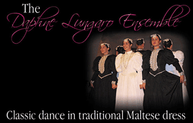
This poster was designed to give no other information than the name of the dance group performing at an event. Unlike most posters it is set landscape in order to permit the long phrases with no return. Here, again, a strong image was sought to contrast with the light, honey-coloured stone against which it would be seen. The lettering naming the group was given an old-fashioned style as a reflection of the Renaissance dances performed by the dancers, and was intended to require closer reading in order to reinforce its name with the viewer.
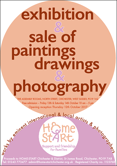
This example of a poster is placed here to give an indication of the character and amount of information that is likely to be given a designer and which must be accommodated within the design of the poster.
The poster was required for an art exhibition in aid of a branch of a national charity. As is often the case, the parameters requested by the organisers were not as easy to accommodate as would be hoped for, but once a design had been conceptualised and agreed, the rest of the design was developed with feedback from the client.
The logo, colours and typeface were specifically requested as they represent the colours associated with the charity. There was also a significant amount of information that was considered necessary, including full address and contact details as well as the number of the charity. Of course the address of the exhibition was required together with dates and timing. So, first and foremost, the information relating to the exhibition, its content, character, location and timing were the important elements of the poster, and these were contained within the main circle.
The main design decision was to ensure that the poster could be read at the required distance, and that there were sensible places for the location of the requisite information. To catch attention, the two coloured shapes reflected the logo of the charity, and an effort was made to order the information in sizes that reflected their importance to viewers and the organisers.
Basic rules
There are a number of rules of thumb which some people use in the design of posters, but I prefer to think of the poster in its setting with the aim of catching the eye from the distance and position a person is most likely to come across it. Once their interest is caught, there should then be additional information which can be read at a closer distance.
The image should be powerful enough to be seen in the environment in which it is to be located, and attractive enough to warrant those interested to move closer and learn from it.
The text should be bold, usually this meaning that it should be large and clear.
The use of strong contrast in spatial distribution of the elements of the design, and vibrant colour will also enable a strong poster to be created. Though the latter is not always a benefit and must be considered in the poster’s purpose.
Having said that I don’t want to deal with rules; let me set out some suggested headings for consideration – and remember that these guidelines hold true for many other areas of design:
Purpose
Posters are designed to put across a message; to communicate with a selected audience. In order to do this they have to catch the eye and engage the senses, enabling information to be transmitted and understood rapidly. This may be by illustration or type or a combination of both. The task of the designer is to produce a display which does this effectively. It will require a combination of invention, good workmanship and a good understanding of the intended location.
Copy
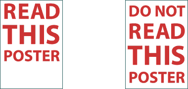
A part of this will require the words, or copy, to be thought out carefully. Copy has both to catch your interest and transmit information, and do so in an efficient manner as space on a poster is at a premium – as is attention span. Both of these examples illustrate a way to make a simple message clear, the first with a clear instruction, but the that on the right with a message that reinforces attention by injecting a little humour into the design.
Language
So the language used has to be as well considered as the rest of the design. It is not an afterthought, it is an integral part of the design both in terms of its visual appearance and its use of language in order to put its message across. The language should match the character and purpose of the poster, and might do this using any of the elements of language, grammar and vocabulary. These two illustrations are deliberately poor in expressing their purpose, and also apply as poor examples of readability.
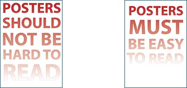
Readability
It is a truism, but it must be remembered that whatever is put down to inform or entertain must be readable. This means that the copy should be capable of being read at the distances at which the poster is designed to be effective. This usually means that there will be two distances, one at which the poster catches the eye and a second, closer, where information is found and transmitted. Readability is not the same as legibility, the capability of actually reading the copy.
Proof reading

Most importantly, copy must be proof read at all stages of the design. There should be no mistakes either in spelling or content; nothing that will stop or slow information intake or, of course, give wrong information. It is remarkably easy to miss a mistake. Both of the examples illustrated here are common mistakes, not just on posters, but also in longer sentences. Always try to get somebody else to proof-read what is written.
Typography and font selection
The selection of an appropriate type and font is a difficult exercise. Fonts, both in terms of their character and size, have to do the work they are selected for, generally having a strong design relationship with the subject of the poster. More often than not one typeface and font will be selected to catch the attention of the passer-by, a second to set down the information to be transmitted, this second font being at a smaller size than the former.
Incidentally, there is confusion between type and font. Type or typeface refers to the style of a family of letters, whereas font is the different variations of it. For instance, ‘Myriad’ is a typeface, and ‘regular’, ‘bold’, ‘semi-bold’, ‘italic’, ‘light’ and a number of others are its fonts.
There are thousands of typefaces to choose from and some would see little difference between many of them. Yet considerable time is spent on designing a typeface, getting each character to work in combination with another to create a coherent typeface. Those typefaces which are really well designed tend to encourage copies, usually of poorer quality. One example is Helvetica from which Arial, a common replacement was developed and which, due to its inclusion in free software and with few able to tell the difference, has taken over from the better typeface.
It is also important to get the kerning right. While many computers will set out a standardised pairing of letters, it is important that the designer examines the kerning in order to benefit, particularly, the larger lettering on the poster.
Layout
Like other elements of the design, layout has to suit the purpose of the poster. Decisions on layout have much to do with the quantity of information that has to be imparted and the character of the subject of the poster.
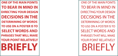
It is generally true that the less there is on a poster, the more legible it will be and the more likely to attract, though there are exceptions. And the placing of the elements of the design is important in adding to the character of the overall design. For instance, a balanced, symmetrical layout might suggest a calm, professional or factual subject; a disbalanced layout perhaps activity or excitement – and it has to be borne in mind the way in which the poster is to be read. These points also relate to other elements of the design.
White space
The use of white space in design is at last being increasingly understood. The tight dense layouts of the past are now beginning to be loosened by giving over more of the poster to white space, or its equivalent in terms of colour. The point to remember is that the whole of the poster does not have to be covered in pictures or text, and the design or important element of the design may, in fact, be the white space.
Use of colour
Colour influences those who are not colour-blind. There are cultural variations but, by and large, blues are seen to be cold and professional, reds hot and exciting, yellows lively and creative, greens balanced, purple meditative and so on. There is a little more about this described on the Islamic section of this site. It is a complex area, particularly bearing in mind that many people have varying degrees of colour blindness, regardless of cultural issues.
The selection of suitable colours is imperative to aid whatever message is being transmitted by the poster. The colour selected should match the intended mood or character of the poster, and bear in mind the points made in the previous paragraph.
Use of images
Some posters work well using just typography; some rely on images. The latter is particularly true of artwork, of course, but a good image can be all that is needed to gain attention and draw the viewer to learn more from the copy. Drama helps but is not the only way of using images; a calm approach can be considered for many applications.
The images may be photographs, of which there are many stock images to be found from a variety of stock libraries; they may be taken specially for the poster, or they may be artwork, again selected to accompany and reinforce the message contained in the poster.
Generally all these notes relate to two-dimensional artwork, but bear in mind that posters can have an element of texture applied to them or even of three-dimensions used to create or increase their impact.
Logo or corporate image
The use of logos to reinforce corporate image seem to be an increasing problem in poster design as it is elsewhere. There is no need to have large logos nor to have more than one though I have seen posters with a string of logos representing interested parties. If this is necessary then I think the poster has failed in at least one of its intentions: it has not made its message clear in the overall design but has had to hide elements of responsibility within the details.
This is a different issue from the copy which is needed to give details to the viewer and needs to be carefully considered before being used. There is also a psychological issue to be considered. Posters with logos tend to be more authoritative to the viewer. This is not always in the client’s interest, though they will often fail to understand its significance.
Location and positioning
There are many formal sites for posters nowadays, but which have high rentals associated with them due to their positioning. This is one of the reasons there is so much fly-posting. But posters are also used in institutions and similar organisations in order to provide necessary or advertising information, and flyers are commonly used in many situations, particularly when there is a degree of immediacy such as in advertising an imminent event.
When designing posters it is imperative to know where the poster is to be located, the distance at which it is to be viewed and the angles of approach. It is with this knowledge that the size of the poster, the shape and size of images and type on it can be determined, and the location of copy. It is no use placing the copy at the bottom of a poster in small font size if the poster is located low on a wall, for instance. Conversely it is pointless making the scale of a poster larger than can be readily comprehended if viewers can only see it from a metre away in a corridor.
Size
Size matters. The size of the poster follows from knowing where it is or they are to be located. It may be that more than one size is necessary for different locations in order to use their siting effectively.
Associated documents and tear-offs
It follows that it might be necessary or a good idea to have associated documents such as flyers available so that people can take something with them to remind them of facts given on the poster. At the low end of the scale it is now common to have a number of tear-offs attached to the poster, each of which can be torn off and taken away by the viewer. A nicer idea is to have a small receptacle from which fliers can be taken for the same purpose. Whichever method is selected, the design must be carried through in order to retain the quality of the purpose of the poster.
Protection
Finally, a well designed poster is often taken to decorate a wall or with the hope that it will improve in value. Some organisations demand protection and supply frames in which posters are protected against theft. If this is the case you will need to know in order to deal effectively with any screening by the frame either physically or by shadowing.
More to be written…