
a collection of notes on areas of personal interest
Why is it we seem to prefer the printed word?
With the increase in the use of the Internet, more information is organised and processed in that medium. However, many people do not have access to the Internet, and others like to have a document they can hold, carry and read at their convenience. There is an easy familiarity with something we can hold, and we are more easily able to find our way through a paper document than, perhaps, we are through a series of screens. Additionally, we can more easily take large sizes of paper around with us than we can screens. Paper is convenient and, here, I am only dealing with paper-based documents.
Many companies now produce documents both on their own Intranets as well as in a paper-based form which can be distributed to those who might not have access, or would prefer to be able to read a document away from a computer screen.
The forms these documents take should be very different as they have to be made available for a different kind of audience, as well as needing to cater for disabled use. The key to their design is, from the point of view of the company, to organise the information in a way which reflects their own desires and aspirations and, from the point of view of the readers, to enable them to assimilate the information readily.
The audience


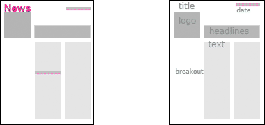
The first two documents here were designed for very different audiences. The document on the near right was designed as a spoof newspaper, albeit A4 in size. It is deliberately visually busy, follows traditional newspaper design, introduces colour for impact and its sub-heads are designed to catch the attention. Both documents use serif fonts but the document on the left uses a three-column model to speed reading: generally the longer the line, the longer it takes to read. Neither of them, incidentally, make enough use of white space to lighten the look and help focus attention.
To the right of the spoof is an early exercise to modernise the information produced by a small organisation. It maintained the two-column approach with which they were familiar, and lightened the banner heading at the top of the page so that it didn’t shout as much as its predecessor. Often this type of exercise is an iterative and long process as clients learn a little about design and the designer learns how far the client will change. The process, in this case, was enjoyable, but this isn’t always the case. Be warned.
Below it are two more of the exercises made in progressing the scheme. It is interesting to note that I eventually increased the strength of the banner balancing it, to some extent, by the insertion of the name of the organisation running along the side of the page.

These two pages are the front and and an internal page from an in-house spoof which was designed to replicate much of an original, in-house, company document. Like the original it is boring to look at but relies on its scurrilous content for interest. This character of design is, in commercial terms, usually a recipe for disaster but, in an in-house environment, not that important – though still a design disaster.

Here, near right, anarchy reigns not just in the content of the newsletter, but also in its visual design which is intended to be a bit of a mess in a similar way to that at the beginning of this page. Not very difficult – but far more likely to catch the reader’s eye. On the right is another spoof, this time designed to be sent as an A5 card at Christmas.
Guide to good layout
So, if none of these examples are any good, what rules should we follow? The first is to ensure that there is a decent amount of white space on the page. In the notional example to the near right – there are a lot of ways to organise the page and this is just one – about a third of the page is left blank. This gives the page a more relaxed appearance, makes it more approachable and, combined with interesting copy, a much more interesting and memorable read.
Font use
Secondly, use a sans-serif font for headlines but serif for the bulk of text as it is supposed to be easier to read – I’ll come back to that in a minute. Bear in mind that many people have difficulty reading, for a variety of reasons. In conjunction with setting the size and style of font, try to keep line lengths relatively short. It is thought that about a dozen words a line is a good standard to aim for. Note that, on this page, I am using both a sans-serif font for the basic text and a line length of about twenty – depending upon how your browser is set. In design terms, this may not be a really Good Idea, but I believe the page is still legible.
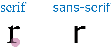
There is an argument that it is the serifs on the fonts that give the viewer the additional information with which to assimilate the words more quickly, but the evidence appears to be mounting that suggests it is a combination of factors that encourage legibility, and that a decision on the use of serifs or sans-serif fonts is mainly aesthetic. You will find here a good round-up of the arguments relating to the use of serif versus sans-serif faces.
Line spacing and length
There are two additional issues that are important when judging legibility. In addition to font type and line length there are:
- line spacing, and
- contrast between font and ground.
The closer together lines of text are, the more difficult they become to read. Experimenting with moving the lines apart should result in a judgment on the optimum setting for this element of the text.
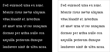
With regard to the colour of text, we are all used to reading black letters on a white background. This high contrast works well but is not necessarily the optimal way of viewing text. I prefer to have less contrast and you might note that many web sites use a very slightly coloured ground, and some use a coloured font – as in this case – which, it is argued, can reduce strain on the eye. I’ll look at this briefly a little further on.
Taking this a stage further you will find an increasing number of web sites using fonts reversed on their ground – white text on a black background, for example. You may also find they are far more difficult to read than black on white and can be quite tiring on the eye. In the print world it is the custom to use a slightly heavier font weight to compensate for the narrowing of the font that happens when text is reversed out. In theory this doesn–t happen on the screen, but it still remains difficult to read reversed out text. If you have to use it, keep it to small amounts.
Perverse as it may sound, recent research has demonstrated that as lnog as wdors hvae the smae bgnineing and ednnig lterets, tehn tehy can slitl be raed rietlavely elsiay. My apologies to any readers for whom English is not their first language.
Having said that, I should also mention that there is evidence that it is not the order of letters that is important, nor – as is often advanced as the most important factor in reading – that the shape of the word is imperative; the Bouma shape as it is termed. Research by Microsoft suggests that we recognise the component letters in parallel and then use both contextual information as well as perceptual to come to an understanding of the word.
The use of colour
I mentioned colour earlier. Bear in mind that many people – more particularly, men – are colour-blind to some degree. I would recommend two things to do:
- firstly, test your own colour blindness by referring to specialist charts such as the Ishihara tests and, secondly
- look at a wide variety and number of examples in order to evaluate what you think works – and what doesn’t.
Contrast

Good contrast is one way of assisting readibility as is a legible combination of font type and size. By this I don’t mean dramatic contrast, but considered contrast. There is a fashion at the moment for very small print combined with poor contrast. In this example the white text is more difficult to read than the black – both grounds are, incidentally, the same 50% grey, but appear different due to their combination with the black and white text.
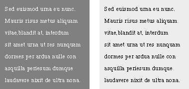
There are also a number of examples where the fonts are reversed out, most commonly white on a black ground. Although in this example it can appear more legible, this can be very trying to read and shouldn’t be used for more than a small amount of text as there is considerable contrast. In fact, as shown in the lower two examples, a reduced amount of contrast can be quite restful and, all other things being equal, aid reading and, therefore, comprehension – the aim of all designers. These examples are all in the grey range but could be improved if the ground is a light, restful green or beige.
I shall write more about this later but, for the moment it is worth remembering that, in order to be read as easily as black characters on a white ground, corresponding characters which have been reversed out should be lighter in weight with greater space between the characters and greater leading.
Incidentally, although this is not a newsletter, you may note that I use a dark blue for text on my website in order to reduce contrast. Also, where I show updates on a page, I use a light background. Neither of these selections detracts from readability.
More to be written…
Posters | top | Web design