
a collection of notes on areas of personal interest
The odds and ends of design
There’s a wide range of designed material available with which anybody can make a visual impact. However, unless you are a professional designer you are unlikely to win a commission to create a design to promote or package a commercial product. But it’s quite possible that, if you are known to have a computer and design software, you may be asked to produce something for a local event, give pro bono assistance or just create designs in your day to day work at the office.

The point is that we are all instantly affected by the visual experiences we see around us, and a graphic of some sort or other is known to be an immediate way of making an impact or getting a message across. This attitude, incidentally, is at the root of many of the unmemorable presentations we are all subjected to, though it has to be said that presenters have much to do with the problem. Lack of training seem to deter nobody. Somehow it is felt that by using a computer a professional design will automatically be produced. In fact there is so much design around that it’s difficult to sort the wheat from the chaff – particularly as, in Britain, we don’t receive a good visual education. But that’s another story to be told elsewhere, and probably by others…
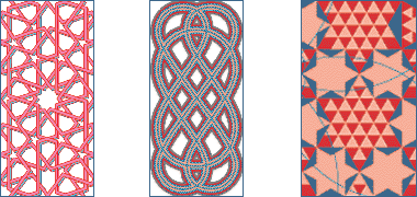
Sometimes during this process studies are made of a particular design interest or problem and which illustrate something which might be developed later. These drawings, which illustrate different characters of geometric patterning, are of – from left to right:
- an Arabic grille, or mushrabiya
- a Celtic design, and a
- cosmatesque design,
all of which were created while investigating patterns associated with Islamic studies. The musharabiya is a very strong, traditional design, here based on ten-point geometry. While carrying out research on Arabic geometric design, I was also looking at other cultures and their geometries, in the case of Celtic – in the middle – with a view to comparing and contrasting the different structures. The pattern on the right is a cosmatesque design and was drawn for comparison with the two geometries adjacent to it. This latter type of patterning, originating near Rome, exists in England only in the pavements inside Canterbury Cathedral and Westminster Abbey.


These three patterns are part of a hand-drawn study series I made on Arabic/Islamic geometries quite a time ago. The drawings were developed with only a compass and straight edge in order to explore the manner in which I have seen craftsmen setting out their designs on gypsum panels before carving them. The three are also all based on ten-point geometry which, as I’ve explained here, relates to the Golden Section, a relationship considered to demonstrate a perfect proportion, and one which is found in many Islamic geometric designs.
I have placed the central pattern here in order to show the even grid on which a variety of patterns can be developed. The top and bottom studies were investigations into two door panels, and are relatively common patterns in the Islamic world. The studies looked at the variety of patterns that can be developed from similar geometries. Here I have illustrated only two-dimensional line patterns, but they can be seen to be quite different from each other. When coloured in as they would be in Islamic tilework, there are an infinite number of ways they can be presented.

This pair of A4 sized graphic images were made expressly for an exhibition of a variety of artworks. Both of them are studies based on Islamic geometry, but they differ in their character. That on the left is purely linear, is based on ten-point geometry and shows something of the construction of a decagon at the bottom of the image with two design developments based on that geometrical device linked above it. By contrast, the design on the right is based on eight-point geometry for which all the construction was first set out but which, on developing the pattern, I chose to omit as its complexity, while interesting on close inspection, conflicted with the simplicity of the design, reducing its overall graphic effect.

There is a secondary effect here; the design on the left above has its external points aligned at the top of the design whereas that on the right sits with its straight edge at the top, displaying heavily on the page compared with the design above left. Turning the right hand design through 45° would give a much more lively effect as can be seen in these two illustrations. Something of the confusion is shown here with some of the additional construction lines shown on the left.

Using the square design above as a basis, I then developed a running pattern as a design exercise. If you look at the junction of the repeated design blocks you will see that the design is not a simple repetitive one, but has a lack of symmetry there which, to me, creates a slightly richer and more interesting design, though creates a lineal emphasis along the line of the pattern, in this case moving right to left.


There are many more examples of patterns based on Islamic geometry set out on other pages of these notes, particularly on the page containing the design illustrated here. This is a recent study developed from a particularly complex geometric construction found on the site of part of the reveal of the eastern Ghurid iwaan portal to the Friday or Grand masjid at Herat, Afghanistan. The design is unusual in that it has a very complex geometric construction, but provides the basis for a satisfying infinite design. These two images have the same underlying construction but are presented at two different scales and have differing treatments to illustrate something of the character and capabilities of this geometric construction.

At the same time as I was developing an interest in the construction of Islamic geometrical patterns, it appears I was producing associated drawings based on the same geometries. This old drawing illustrates a classic impossible triangle, yet the basic construction can be found in many Islamic patterns. Here the underlying geometry is far more complex than is needed, but would have been set out to make the drawing more interesting. It’s not a particularly interesting study, but it’s a contrast to the patterns above.

This design was developed on the basis of a six-point geometry, related in part to a design found in many places, perhaps that of some tiling in the Alhambra being one of the best known. At its centre is a simple hexagon created by the usual method of running six circles around the circumference of a circle of the same diameter, their centres being on the circumference.
Within the central circle, six more circles are described each having a diameter half that of the central circle. On the intersections provided by the geometry, the shapes of the moon are selected together with points for establishing the locations of the six stars. While the geometry for locating the additional whorls is not shown, it is an easy exercise to establish the overall infinite pattern.

Line drawings were not the only way patterns were investigated when beginning to examine their underlying geometries. This small study for a larger piece of artwork – the original being around 150mm across – was based on a simple underlying hexagonal grid, shown to the right with sets of lines at 60° to each other. It is essentially the same basis on which a honeycomb is constructed. There are different ways of reading the pattern, but at its simplest it can be seen to be part of a field of mutually touching circles from which a number have been removed, based on a consistent rule. The overall pattern shown here should be familiar to anybody who has worked with isometric grids or projections.

A number of other studies were carried out at the same time as that illustrated above. Some were based on the principles governing Islamic and Arabic geometry – one such is illustrated on the left of these two examples which is based on five-point geometry – and some on a different principle relating to a series of decisions governing the distances between the centres of the dots – such as that illustrated on the right.


There are many more studies on the Arabian / Islamic geometry pages, particularly on page 1 and page 2 of that section. These sketches are placed here as the original two were drawn casually many years ago with the latter two designs made more recently, the common theme being that there was little design intent behind them. They might be most usefully considered to be doodles.
The first of the four illustrations, top left, was the original sketch drawn with a pencil line on paper and based on 8pt geometry. It was drawn to see how a rosette might be developed to produce a number of shapes which might be coloured to create an interesting image. The illustration, top right, was traced on top of the initial drawing with red ink, creating a series of outlines. That was forty-five years ago. More recently the outline was photographed, transferred to the computer and simply coloured in a drawing programme, the two images shown being the initial colouring and its inverse in order to gain an idea of the feeling each might engender in the viewer. This process is investigatory; there was no end in mind.

While investigating geometrical patterns some time ago I made a small example of patterning using coloured ribbons. The exercise was never made into a more worked example, but this small item sits pinned to my pinboard where it has been ignored for years. It is yet another example of a quick design investigation which has yet to bear the fruit of development into a finished design or something of practical use.

Much of the design work I carried out years ago has been lost or disappeared for one reason or another, usually for the better. But every now and again I come across work I executed a long time ago and that has been set aside, lost or misplaced, and not seen the light of day for years. Perhaps that is for the best, but this study is one such drawing I must have made forty or more years ago. It reminded me that it was a study for a woodcut I later made, my first essay into woodcuts. I recall that the design was the basis of a series of greeting cards, each different by the way in which the block was inked, particularly in the colours used. But this was an original sketch that was eventually used as a basis both for the wood blocks as well as printed designs.

The reason it has been placed here is not because it has any great merit but because it reminds me of the days when drawings were made by hand. I know this was not the only drawing I made as this one is unfinished and at least one other drawing had colour and shading added to it. I suspect it was carried out by first drawing in pencil and then going over the lines with a Rapidograph pen, a favourite method in those days, though I sometimes used a Graphos or calligraphic pens to give more character to lines.
Note how boring the even line of the pen is here. Also it is important to bear in mind that original sketches for wood blocks are designed in reverse for the final image that is required.

The only copy of the woodcut I have is added for comparison. Each print was different both in colour, in the number added to the print, and to their positioning on the print. The design immediately above has been developed from one of the two images here so that something of the texture can be seen, creating something of the character of the scales of the dragon.
From time to time there is a need to produce a quick design for one reason or another. Here a pair of crossed pencils was quickly drawn for a small project. The perspective is not correct, but it met the need. To the right, an A4 cover was needed for a report about the State of Qatar in the Arabian Gulf. It’s unusual coastline, similar to the outline of a hand and linked to a sloping coastline of Saudi Arabia, suggested the staggered, overlapping design with the colours being an approximation of the colours of sand and sea.
And, to the right, are three examples of visiting cards, proving the rule that a designer really shouldn’t work for himself or, perhaps more accurately, he really should know when it’s time to stop. They are all completely over-designed and not at all good of their sort. The good news is that none of them was used because at least I recognised they were poor. I really must have another go at it…

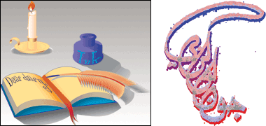
On the right of the three visiting cards is a design based on my signature in Arabic. It is not ’proper’ Arabic writing or calligraphy but is a version of my signature based on the ’tughra’ – a stylised form of calligraphy where the artist is permitted considerably more latitude than there is in the rules of basic calligraphy. It is a design which catches an Arab’s eye, but perhaps not for the right reasons. There’s a larger version of it below, right.
And here to the right is yet another visiting card, quickly made and relating to this site. I prefer it to the others in that it’s simpler and has better proportions, being based on the Golden Section. Looking at it now I can see that it can – and needs to be – amended.

Here, to the left, is a sketch design made to illustrate a children's story relating to an old diary. It’s useful to make quick sketches to see if you are working on the right lines. A version of this would have been developed as a frontispiece to the book. To the right of it is a version of the same piece of calligraphy you can see a little further up the page as a visiting card. I struggle with this particular design from time to time knowing more or less what I want to do with it but never quite being able to get exactly what I want out of it. I think it works well as a hand-drawn piece of calligraphy but not so well when formalised.
And this design, to the right, is the latest formal version of it complete with vowelling – the diacritics – but is nowhere as attractive as the tughras produced by the Ottoman empire where the rulers used their tughras as seals, the design having a legal resonance on official documents. This version of the design is getting a little nearer what I want to create, but I think it still has a long way to go in terms of the geometry of the different curves.

It is not easy to work Arabic calligraphic designs without a thorough understanding of the rules governing them. I admit that I don’t have this knowledge but it still fascinates me enough to persist in attempting to produce simple designs of the character shown here. This may not be correct but it has a balance that appeals to me. I shall continue to work on it and see if I can improve it. The design is based on the two characters jeem and lam, though I have to admit it appears to be more like jeem and kaf.

So here is another simplistic attempt at the same two letters, this time drawing the lam a little more accurately. As a general rule there is considerable latitude allowed in artistic interpretation but, at the back of a calligrapher’s mind there are rules that take years to learn and not readily set aside. The benefit to me is that I don’t know the rules and have more latitude than I should. In this study I have made the letters heavier by significantly altering their proportion. Again, this is a study that should take far more time than I have put into it. Studies such as this deserve better.

By contrast, here is a selection of graphic studies that were made when investigating a design to be based on the Arabic word for ‘love’, itself one of a series being developed as a related series. The intention was to produce a design that could be used for either a simple, clear graphic poster or, perhaps, a greeting card. The scale of this graphic may not be the best way of demonstrating the strength of the alternative designs as, here, they are small and closely grouped whereas a final design will need to stand by itself on a ground with considerable white space in order to focus on the strength of the graphic’s form. In giving the design further life, it was thought to be particularly important to make a clear distinction between heavy and fine lines, to balance the proportions of the word with its decorative elements, and to introduce a strong colour as a further balancing device.

This design is based on something I saw and that appealed to me. Designers often find their inspiration from designs that catch their eye and, with a massive amount of work available to us daily, it is difficult not to be affected by other people’s work, either consciously or subconsciously. Here a simple Arabic greeting, eid mubarak, has been repeated and coloured to provide what I hope is an interesting pattern. The work should be seen at a larger scale than is illustrated here as it’s designed to decorate a card. Again, more work is required to produce the optimal relationship between the different lines.


These next three designs were originally based on the same lettering. While the first is developed using a proper font, the second and third designs ended up as being hand drawn, but in a drawing programme rather than freehand – though nearly all designs are initiated freehand before using a drawing programme.
There are a number of different ways in which people greet friends and relations on their cards on the occasions of New Year and ’Eid. This design was produced for a card and reads ‘kull ’aam wa antum bikhair’ using the phrase turned round a centre six times. Roughly translated it reads ‘I wish you blessings every year’ or, perhaps ‘…throughout the year’, and is perhaps more appropriate at the New Year, rather than at ’Eid.
The script is based on a standard Arabic font and the words given different weights and colours with a little bit of work to achieve the overlaps in the last word. The idea was to create the effect of a knot at the centre with the rest of the words falling away to create the star. In common with many of the ideas that come to me, it could have done with a bit more work before seeing the light of day…
The next design might appear to be a more traditional work of calligraphy. It was drawn in a vector programme and then rasterised in order to add effects, notably the drop shadow, now appearing to be a little jaded in graphic design terms. It reads ’eid mubarak and, looking at it here, appears to use the same colours as many of my other illustrations. As I’m not an Arabic speaker there are likely to be a number of mistakes in it so I can’t advise copying it, or the one below for that matter. As with the design above, now that I see it in place, I can see a lot of amendments that might usefully be made to it. But isn’t that always the case?
The third design has similarities to both of the first two designs in that it is based on the phrase ’eid mubarak as in the design above, and is rotated as in the first design. This time the phrase was rotated five times, alternatives of four, six and seven not proving to be as visually pleasing. There is a slight variation in the colouring of the two words to create a little distinction, but otherwise it is similarly coloured as much of these calligraphic studies. An attempt has been made to give the design more visual movement compared with the two preceding it.

Most of the schematic designs on this page can be readily seen as being based on recognised forms of Arabic script. Recently I have come across more modern and extreme forms of Arabic script designs with the lettering outlines demonstrating considerably more manipulation in their lines, overall forms and relationships. This creates a more lively overall design, perhaps more immediately associated to the Western eye with the cursive designs of the 1960s, characteristically used on flyers, posters, record sleeves and the like of that era.
Here are two examples of the phrase ’eid mubarak, my first attempts at this type of modelling of Arabic script. It has yet to be developed into a more definitive design, but is placed here as a marker, essentially to remind me to do more work on it, and complete a finished design.
Kufic and other patterns

This piece of original artwork was executed a long time ago. Although it is no longer in my possession I came across this photo of it and thought it useful to include as it provides a contrast with my later, computer-generated work. It reminds me of the concentration required to produce mistake-free artworks, and the degree of manual dexterity needed in those days. I would still recommend it as an exercise at it puts you far more in harmony with the design than does computer-aided design work.
The design consists of four paragraphs from the Holy Quran, set in Kufic forms, and drawn using four different styles. There is a semblance of geometrical design superimposed on top of it that I think was there establishing a basic setting out for the four panels, but the whole design is really an exercise in hand-drawn graphic design.
As with all my work at that time, the study was made using a pair of compasses holding a fine blue pen, and slightly thicker pens and straight edges for the calligraphy. To give a sense of scale, the paper on which the design is made would have been 210mm square, the width of a sheet of A4 paper. On a technical note, you have to take great care not to make large holes in the paper with your compasses and, seeing it again, the crossing of a number of lines has produced a heavy dot which should really have been avoided by lifting the pen.

To continue, here is a study in Kufic design, shown in these first five graphics. The basic pattern was designed with the specific intent of producing a small square from the phrase ‘Islamic art’, one that might be used to create, by repetition, a running band as a frame or border. It is composed of four pairs of words, each pair at right angles to the one preceding it, and the second word comprising of four shapes, excluding the diacritics or dots.

In the second of these five illustrations are three graphic studies that may give some indication of the difficulties experienced in attempting to find symmetrical solutions to this character of design. Note how there are significant differences in pattern in each study, though all have strong overall shapes.

With simple patterns such as this the skill lies in forming the words so they are as accurate a reflection of the written word as possible – and are still legible, of course – as well as ensuring that there is as little free space left within the design as possible. In the left graphic in the first illustration above you can see that I was not able to accomplish this, and left spaces in the four corners of the design in my attempt to make the lettering relatively accurate. I then decided to fill the empty spaces by curving back the tail of the letter ‘y’ which wraps around and into this space. You can see the revised study illustrated in the right graphic in the first illustration and, larger, here to the side with a drop shadow added to enliven the design. The other issue I had with this design was in not being able to start the first word where I wanted, but having to locate it towards the centre of the design rather than at the edge as I wished. I shall have to look at the design again and see what I can improve.


The third and fourth illustrations show the graphic extended as alternative versions of the border or frame that I first intended. These two different treatments, even at the reduced scale illustrated here, show how small decisions can have a dramatic effect on the outcome of a design. It is sensible to repeat that this study, and most of the others on this page, are simplistic and obviously not the work of an Arabic calligrapher.

This group of three designs were a first attempt to produce a Kufic version of my name. None of them is as successful as I had hoped, but it was an interesting exercise in working within a self-designated set of rules with a view to filling the containing squares perfectly. I don’t think it’s possible; all three designs, and others I’ve tried, have a square that does not allow a diacritic or an element of a running line to be used.

Following from that, here are a couple of sketch developments of one of the designs above, illustrating possible different treatments. The left of these two images is the design on the right above, with a small development of the last two letters of the name, ‘ba’ and ‘ya’, as a variation on the right. This latter variation does not seem as successful and might be misunderstood due to the placing of the diacritics which introduce ambiguity in at least both these letters.

This pair of variations of the above left design looked not at variations of the Kufic, but at different treatments of the same design, this time with the Kufic either recessed or on the top plane – the effects being produced with the introduction of dropped shadows, not a graphic design feature that is popular at the moment. It is interesting to compare and contrast the two designs which are based on exactly the same Kufic elements.
Calligraphic scripts in Arabic are required to conform with sets of precise rules in the execution of their manuscript form. But some of the most beautiful examples of calligraphy have stretched these rules, and this is certainly true of the work of many of the designers of modern Arabic calligraphy. Traditionally, calligraphers learn their craft formally over several years and, of course, continue to learn and develop those skills over time with practice and experience. The skills they are required to employ are both mechanical as well as artistic, and it is fascinating to watch calligraphers at work as they think through and execute their work. In contrast to the work of those skilled designers, the studies that are set out here, though, are very different in their design quality.
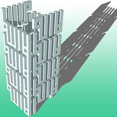
Kufic script has interested me for some time now, particularly in its cubic, three-dimensional form which has so much in common with architecture. Here are two studies based on the first part of the shahada where the Kufic letterforms have been used to produce a building-like structure, one that could, in theory, be constructed. The first is deliberately designed as a continuing tower, the second as a regular cube. They both consist, in effect, of two-dimensional letterforms, given depth and then used on a three-dimensional form. So far I have not been able to design them as true three-dimensional constructions but, from time to time, I have another attempt to think it through.
This illustration just reads ‘Islamic art’ and was designed to be used at a larger scale as, at this scale, it is not as legible as it might be. It was also designed as a two dimensional pattern to be placed on the surfaces of a cube rather than being, as the other ones tend to be, three-dimensional lettering more integrated with the cube. Again, the work was investigative, the main process I use in an attempt to improve my studies, and it tells me that there is more work to do in order to benefit this character of design.
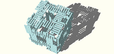
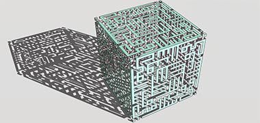
These two examples are similar to those above. They are essentially the same design using a Kufic form in two-dimensions, but I have formed the top one as a hollow cube, the lower as a solid. In many ways these are the type of exercise that used to be common in design schools of various sorts. They make you think about three-dimensional forms and the spaces in and around them. It would be more interesting if I could get the design elements to interlock, but I have not yet been able to do so. I find this type of work fascinating and have used it from time to time in greeting cards such as this example, again using the phrase ‘eid mubarak’, where the design has been constructed in the form of a maze, a design which lends itself to the laying out of a real maze or, perhaps, a parterre ’ although these are usually symmetrical about a central or cruciform axis.
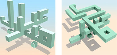
The Kufic form of the design above, as well as these next two objects to the side, also bear strong resemblance to a simple wooden building toy I designed many years ago, and which is illustrated on a later page of this section. This form of design can also be a good student activity or exercise, enabling conceptual spaces to be investigated within a pre-determined or self-specified series of rules, either as blocks or as spaces. In both cases the designed objects can be considered as sculpture at whatever scale is thought appropriate; they may be considered as small objects that can be held in the hand, climbing frames for children, or as urban landscapes. Oddly, I have never tried this with Roman letters; perhaps that is something I should look at next.
In this case the rules specified relate to the selection of the Kufic letters and their repetition over a six-sided cube which introduces the problems of whether or not to employ reflection: in this case there is only rotation. There is more information on patterns here on the Islamic geometry page.

This is a much simpler design executed in a simplified Kufic form with the greeting ‘eid mubarak’ repeated four times around the centre, and the letters projected. Projection or dropped shadows are an easy way to lift a graphic off the page by giving a sense of realism to it. These are not difficult to design, the hardest part is producing the Kufic form of the letters as accurately as possible.
The benefit of this kind of exercise is that it forces the designer to think in three-dimensions and develop solutions to problems of his or her own making, an exercise faced by all designers working in both two and three dimensions. It may be a truism but designs which are inherently and internally consistent tend to be more coherent whether they are easily understood or not. In a sense it can be seen to be similar to the coherence which comes with the underlying geometry of Islamic designs. What I enjoy about this form of design is that the problems are all self-imposed though there are rules to be obeyed in the way the characters are constructed. In my case I’ve I tend to take a non-Arabic view of the forms which purists will think wrong.

Finally a variation of the exercises shown above. This graphic was developed as a design for a water feature in an Islamic garden. In fact it needs more work in order to join up the three pools, and I think that the narrow gaps would collect rubbish, another reason to reconsider it. But it is placed here to illustrate another way in which calligraphy can be adapted to a different design discipline. Using Kufic calligraphy the design spells out the phrase ‘The universe belongs to Allah’ and was thought a suitable phrase for a landscaping water feature such as this.

Contrasting with the ‘eid mubarak’ graphic just above is this design, again wishing ‘eid mubarak’ to its recipient, but in a more normal manner. Designed to fit onto a standard card size there is sufficient space around it to allow it to float on the card. Both outlining and drop shadows are used to create a more complex design from the simple Arabic Naskh lettering.

These next three pairs of graphic studies are for the beginning of Ramadhan when ‘Ramadhan kareem’ is wished to Muslims. The lettering is the same in each of the two roundels of the first illustration, and similar in character to the preceding ‘eid mubarak’ graphic. Note that the design on the left looks to have larger lettering against the simpler background compared with that on the right, and perhaps that the latter design appears to be overly complex due to its background.


The second of the three designs shows two Kufic style illustrations of the same phrase testing alternative ways of grouping the phrase on a four-fold design. Neither of the two designs is yet fixed but will be worked on for the next time Ramadhan comes around when I suspect that I shall have the lettering of the first example sitting on a geometric pattern or a design based on a moon and stars theme, and the second developed, perhaps, as a three-dimensional graphic. The third of the three designs shows another way of achieving a more interesting illustration, though one which adds complexity at the expense of legibility. The graphic on the left is the basic design sitting on three copies, each rotated at 22.5° with the second graphic exactly the same, but with each layer having 50% transparency. Although they are slightly more legible at a larger scale, an alternative way of improving legibility would be to make the different layers slightly different in colour.


Utilising the same principles that enabled me to create many of the three-dimensional Kufic graphic effects on this page, here are two more variations of the two-dimensional ‘Ramadhan karim’ greeting made above, this time developed into three-dimensional figures. In the first of the two illustrations the two-dimensional graphic has been given a depth equivalent to the stroke, and six of them have been joined to form the faces of a cube. In the second example, I have inserted a transparent cube inside the six faces in order to give a little better legibility to the surrounding graphics. Whatever design I eventually decide on, it should be suited to a standard card size, although the two-dimensional graphics above are best suited to a square format.

A little further up this page there are a number of studies based on the greeting made to people at the time of the ‘Eid holidays, and that is ‘eid mubarak’. This study is similar but wishes the reader instead, ‘Eid sa’id’ or, literally, ‘Happy Eid’, a slightly different way of greeting at these festive times of the year.
The design is a simple form based on an Arabic calligraphic script reading in from the right and rotated five times, this being considered to produce a more active figure – odd numbered figures appearing more mobile than even-numbered figures. The lettering appears on a simple ground with the effect of being cut out. Again, the colour selected for this graphic relating to a holy time of the year, is a pale green.

This is a later version of the design for an ’eid mubarak greeting card, but it is one that misses out many of the diacritics that are characteristic if not necessary in Arabic calligraphy. There are a number of problems with the design that I may or may not get round to correcting, but I liked the tension in the balance of the floating shapes as well as the strong contrasting border, and thought I would let it sit here for a bit and see how I felt about it.
It will be apparent that this design has not been drawn by a calligrapher and that there are significant errors or eccentricities in its drafting. And, while the drop shadow effect is a cliché that has not been fashionable for some time, and has been over-used in a lot of my work, I thought it might be suitable for this particular design, or at least in the first iteration that is shown here.


Just as the design above carries a warning relating to its not having been developed by a calligrapher, so should this later study for another ’eid mubarak greeting card. But, compared with the study above, this exercise has been developed with diacritics and full vowelling in order to flesh out the triangular design. It was developed with the intent that it might be rotated a number of times with, perhaps, the ascenders of the alif and kaf running into the ascenders opposite, with an inter-weaving at the central crossing and using an even number of elements, four or six in order to achieve this.
In the event, this proved to be difficult due mainly to the different character demonstrated in the widths of these two ascenders which, in calligraphy, are created by an up-stroke of the pen for the alif and a downstroke for the kaf. While this is evidently not an accurate calligraphic study but constructed with a computer graphics programme, it will be mainly seen as such – hence the decision not to link the ascenders. As a single calligraphic device, the design can be seen to be poorly balanced with more background on the left than the right and needs a little more consideration and adjusting.
The lower of these two graphics illustrates the single ’eid mubarak design with, on the right, the graphic block rotated to create a six-point repeat design. At this scale the design is a little muddy and needs to be seen at a larger size. Bear in mind that these graphics are for illustrative purposes; the actual design, from which these studies are taken, is significantly larger.

For the first time, here is an attempt to integrate a piece of calligraphy with a geometrical study, in this case combined with a slim moon which is often associated with the ’eid greeting as an element of the marking of the sighting of the new moon at ’eid. The relationship between the moon and the underlying geometry of the pattern to the right is not as evident as can be seen at a larger scale, suggesting it should be a larger element of the design. So the second of the two illustrations can be compared with the first in this animation where it can be seen that the design still needs work…
It is not only on the occasion of the two ’eid celebrations that greeting cards are exchanged, but ramadhan also sees the sending of greetings, one of them being in the form ramadhan hadiat al-rahman, which might be translated as ‘Ramadhan is the gift of the most gracious’, or, perhaps ‘…merciful’.


The graphic illustrations shown here were part of a quick study to investigate whether the phrase might be successfully incorporated into a circular design, the words being distorted radially as they are established as a continuous phrase around a circular path.
The words were constructed on a framework using fifty-six radiating lines intersecting with five equally-spaced concentric circles within which the words are delineated. A noticeable characteristic of this construction is that the elements of the letters constructed along the circles are a constant width, but the elements of the letters radiating from the centre are tapered.
The first two designs show how the phrase might be established using rings set at different distances from the centre. Note the different characters of distortion these distances create. While the external diameter of the two designs is the same, that on the left was created with rings further away from the centre than the central design. The design on the right has the two designs added together, one of them reduced and placed inside the other.
The second of the two graphics is a developed design, one of a number of experiments which might be taken further in the fullness of time.


In contrast to the more fluid calligraphic style of the above designs, and the rigid geometry of the Kufic style designs, are these two pairs of illustrations which were produced for use with the ‘eid’ celebrations in mind. They have more rigidity in their lines than do the calligraphic styles above, but have a similarity in the standard widths of the lines with Kufic. The first pair of designs are the greeting reading ‘eid sa’id’, and the second pair, an alternative greeting, read ’eid mubarak.
The designs were deliberately intended to have a different character from the Kufic or calligraphic styles I’ve generally used and, as such, significant latitude can be seen in the rules that attempt to govern the deployment of the lines.
Each pair of designs illustrates the two words of the phrases rotated from a different point. There are a number of ways in which phrases can be rotated, these are two of the attempts made.

This is a two-dimensional work, contrasting with that above in a number of ways, but here to make a point by its lack of the the drop shadow effect that is often used to dramatise design patterns.
Notably the design appears to be far more complex than most of the previous examples. At first glance it has something of the appearance of a computer chip circuit, but it is relatively easy to comprehend.
The basic design is established with two calligraphic phrases – ‘kull a’am wa antum bikhair’ in the centres of each side, and ’eid mubarak in the corners. Each is repeated to create four versions and fitting together after rotating through 90°. The two calligraphic phrases read in from the top- and middle-right respectively with the phrases rotating anti-clockwise around the centre of the design.
Due to an inability to find a way in which to interlock the phrases without gaps, decorative pale blue spaces have been used to fill vacant spaces, and diacritics for the two phrases are shown in red and yellow.

This lower version of the above design has the ’eid mubarak phrase added to the square spacers contained within the ‘kull a’am wa antum bikhair’ phrases. At a different scale the centre of the design has the phrase rotated four times, each delineated with lines a pixel wide which creates a small but sharp image. Normally I draw designs large and reduce them, but this creates blurring. But this design has been drawn at its finished scale rather than being drawn larger and reduced to fit the width of the illustrations on all pages – 380 pixels wide. Having written that, this illustration is the only example on the page that is 379 pixels wide. The difference between this and that above should not be noticeable. The phrase in the squares has had to be reduced and will appear slightly blurred. Interestingly, the thinner form of the phrases lends a Far Eastern look to the corners of the design.

While I have experimented with other colours, or have introduced more than one colour in designs such as this, they never seem to work satisfactorily even if confined to the green, blue and yellow ranges. Unusually for me, the card is square in format, the shape selected to produce a solid visual base to the more active graphic.
With a similar colour scheme, but this time with a sand-coloured ground, here is a piece of calligraphy wishing the recipient ‘eid mubarak’, a number of examples of which are found higher up the page. This time a simple statement of the greeting was made and turned three more times to construct a four pieced plane and given a drop shadow, then this group was turned by 15° five more times on separate planes to create a 24-sided pattern, the top plane being given a little more definition by the addition of a white line around the characters and the lower planes each being increasingly transparent.

The original piece is six times the size of this graphic and is obviously sharper and more accurate, but these images show something of the effect I was after. At this smaller scale there is an argument to make the receding planes lighter in tone or even of different colours to project the top plane. But the design is deliberately coloured this way in order to encourage the viewer to work at its interpretation.
In the lowest of the above three graphics, I have illustrated the difference in appearance when the same design is rotated anti-clockwise through 15°. Designed to be read from top right, the rotated design has a more lively appearance than that on the left due to this effect.


In a similar manner to the small illustration on the right of the two immediately above, the next two designs have been rotated anti-clockwise 15° in order to give a more lively appearance to the phrase ‘ramadhan karim’.
Continuing the development of designs incorporating a spinning phrase, in this case also occuring four times, these next two exercises are based on variations of a design using the phrase ‘ramadhan karim’, a phrase traditionally used in marking the begining of the holy month of ramadhan – in the Gregorian year 2021, this beginning mid-April.
In the first of the two designs the two words of the phrase ‘ramadhan karim’ have been given slightly different colouring, both a little darker than the phrases nested below which have all been given the same, but lighter, colour tint to improve the legibility of the primary phrase.
In the second of the two designs, a small alteration has been made to the way in which the nun or ‘n’ of the word ramadhan appears – it has now ben placed below, and reads on the same orientation as, the rest of the word – and the kaf or ‘k’ of the word karim crosses under the word ramadhan between the letters mim or ‘m’ and dhal or ‘dh’. This allows for the creation of a tighter design, while the five repetitions of the design set below, all rotated 15° anti-clockwise from each other, help to create a more active, spinning character to the overall design.
The first of the studies a little way above is based on the traditional ‘Eid holiday greeting, ‘Eid sa’id’ and using a cursive calligraphy. The following rough studies are of the common greeting made at the beginning of the Islamic New Year, ‘kull ’aam wa antum bikhair’ and are based on a Kufic style used above. There is also a common alternative greeting, ‘kull al-sana wa anta tayyib’ which I also mean to try out. These first two illustrations show four ways in which the words of the greeting might be rotated in order to create a degree of symmetry. They are here to show that this kind of work is not easy.

The first illustration shows two ways in which the phrase may be used twice, rotated once at 180°. The original intent was to find ways in which the phrase might be enclosed within a square leaving little or no blank spaces. As you can see, in the example on the left it was not successful so an attempt was made to create a more strongly defined square, but this time only a little more successfully, the intention being to have a secondary illustration in the centre or, alternatively, to have the letters ‘alif’ and ‘lam’ extended and intertwined to fill the space there.

This second illustration shows two ways in which the phrase may be used four times, rotated three times at 90°. It was realised that this was even less likely to produce the square frame originally sought, but it was thought that a shape might be created which would lend itself to being repeatable in a geometric pattern. Interest in these patterns is created by having as irregular shape as possible, trying to ensure that the positive lettering will fit into the negative blank spaces surrounding the lettering.


There are, however, dangers in creating shapes which knit together too accurately. These next two examples are based on the example above on the right, and are not particularly tight. It is easy to see how the shape of each group of phrases – in effect, a tile – is almost lost in repetition in the first example here, though there is a discernible shape created by the blank spaces which gives the pattern a degree of scale. The second example uses the same pattern or tile, but draws the tiles a little further away from each other in order to create a more individual pattern by virtue of the shapes created by the blank spaces between tiles. Notice how the apparent scale of the design is affected by the distance to which the tiles are drawn apart. Another way to bring out the separate tiles, assuming this might be desired, would be to use colour or tone to do so.

This design is based on the left example above and forms a strong square pattern of blank space in the tiling. You may also notice in both examples, but perhaps more strongly in this design, that the pattern appears to tilt slightly down to the left. This is an optical illusion apparently created by the relationships of overlap in the horizontal and vertical directions.


This pair of sketches have their designs based on a piece of Kufic calligraphy reading, in Arabic, Eid Mubarak, the traditional greeting wished at the end of Ramadhan. The first sketch shows the basic design unit, given a three-dimensional treatment. The two words are designed to intersect, and an attempt was made to create a degree of symmetry about the middle of the letters aliph and kaf, the reem sitting between them.
In the lower sketch the basic greeting was arranged as a block of four, the pattern created by rotating the greetings at 90° to each other, and then that block used to fit into a running pattern. The process is similar to the studies above with considerable testing and redrawing of the original words. There is not a perfect fit and it’s possible that, with a bit more work, the pattern could be improved upon. There is specialist software available to provide assistance in creating interlocking designs, but I prefer to work without it.


Five years later and there have been some small amendments made to the original design to see if it could be improved. The most significant idea has been to introduce some elements of the design to be set at 45° to the main pattern. The diacritics have been rotated and, instead of the squared junction of the aliph and kaf, these ascenders have been continued with a 45° twisted junction to bring a little contrast to the otherwise horizontal and vertical character of the design.
One of the exercises related to this design was that of putting the greeting into a patterned form – in this case the interest was to see how the phrase might look when repeated four and eight times, these being the natural multiples when looking at square geometric forms.
As a natural extension to that exercise, a quick attempt was made to see how the design might work with the ascenders joining at 60°, giving the capability for the repeated design to form a six-sided design which itself might be assembled into an infinitely repeated pattern. This illustration shows two simply repeated examples of the basic 60° pattern, but it is evident that there are a number of alternative ways to rotate the phrase.

In this example there are two examples of how the design containing six rotated greeting phrases might be organised into an infinitely repeating 60° pattern. There are obviously many variations on this type of pattern, each dependent both on the manner in which the six greetings are arranged, as well as the relationship they groups of six have to each other. In addition to these, there is the different appearance given by turning the overall pattern through 30°, as illustrated in this graphic where two alternatives are shown.

But working without specialist software is exactly the way in which traditional designers worked, and in which many do so nowadays. The organisation of phrases that are readily formed into coherent designs that are legible and with an even density, is not easy. Some phrases are readily organised, others not so. This group of illustrations, which takes the greeting phrase ‘eid sa’id’, is a case in point as it is not readily capable of being organised into a simple and tight design. These studies show a number of ways in which the phrase might be used, each being read in from the top right corner. Six of the seven studies have been arranged in repetitive patterns, while the seventh begins in the top right corner and continues around the square anti-clockwise, repeating the phrase. Because of the obvious limitations for geometric coherence, a small number of variations from the accuracy of the phrase have had to be introduced resulting in an uneven texture compared with the other six studies.

Here is another version of the ’eid mubarak greeting. It can be seen to be very similar to that above, but has more symmetry. The ’ain and dal letters of the first word are the same figure reversed, the ascenders of the alif and kaf are shortened, and the reem proportions are altered. The whole of the design is constrained within a square.


These three studies are part of a group of studies based on the design illustrated above and below. Each of the designs can be seen to be based on a grouping of four of the patterns rotated symmetrically around a central point. In all of the examples, the manner in which they are brought together at the central point of the design creates a slightly different character for the overall design.
As with many designs, all of the studies might be improved by amending the basic structural unit, as it can be seen that as elements are brought together at the centre of the design, they are tending to describe a swastika, something most modern designs attempt to avoid – although that pattern can be seen in many ancient designs, particularly pre-Islamic. The lowest example illustrates this effect the most clearly of the three examples.


These further three groups of patterns were developed as a continuation of the previous study, and were based on a slightly amended version of the original graphic block shown above. The first illustration shows the basic block pattern. The flat pattern has been developed with a small element of interweaving used – essentially a simple crossing – while, on the right the pattern is given a drop shadow, a common device to create a little more life in the design.
Interestingly I made this group without looking at the previous study, finding myself recreating virtually the exact design, suggesting that the rules I established will not permit much variation, and that it might be an idea to look at looser, or at least different, guidelines. The next step would be to change the rules, of course, and see how that will adjust the resulting pattern block.The first three studies were designed to be kept as tight in the centre as possible, whereas the lower group of studies explored a much looser arrangement.

A final consideration when looking at this type of work is the manner in which the pattern should be read. Generally you might anticipate that Arabic will be read from the top right corner to the bottom left corner, but it is also possible to construct a legible pattern from the bottom right corner. In these examples of the greeting, ‘eid sa’id’ – an expression used twice in each example – the two examples on the right start in the top right corner and proceed in a counter-clockwise manner. In the two examples on the left they start at the bottom right corner and proceed clockwise, this being counter-intuitive but valid.
Regrettably the design does not lend itself to be as tight as some of the other designs above, but the next group of illustrations show something of the way in which the start of the phrase ‘eid sa’id’ – ‘eid – might best be followed by the second word – sa’id, an issue that affects legibility.

Here the phrase beginning with the first word is shown clear, and then hidden by the end of the second word – one example with the phrase starting top right, the other with it starting bottom left. Bearing in mind that the first word has been slightly emphasised in order to make the point, it can still be seen that the phrase is more legible when its beginning is not masked by the end of the second word.


These two rows of illustrations are notional design arrangements having different spatial relationships between the two words. The first row has the ‘eid sa’id phrase beginning at the top right, the second with it beginning bottom right. In both cases the base line of the first word has been kept common to all eight designed examples of the phrase.
It is evident that the phrase is readily legible in all eight cases, this despite there being no emphasis to the outline of the first words as has been given in the examples shown above.

Designs of this sort are not necessarily suited to develop into more intricate patterns if their legibility is to be maintained. In the case of this example, an exercise has been carried out to see how easy or difficult it is to create a legible, infinite pattern but with the added problem of keeping the pattern moving horizontally and vertically, and having no diagonal offset. While the square, open areas do run horizontally and vertically, gaps in the alternative squares create a diagonal feature of the pattern which gives a degree of movement to an otherwise static design. In creating the basic square pattern, some liberty has been taken with the script, ‘eid sa’id, eliding the two words and making the phrase a little illegible.
This next pair of sketches are two more attempts to see how ‘eid mubarak’ might be organised, this time in a three-dimensional form using the two words to cross each other. The form and relationship between the alif and kaf are different in the two examples, but the main difference is that the two words in the first example are maintained at right angles to each other in the same horizontal plane whereas in the second example, the planes lie at right angles to each other.

The difficulty with this type of work, which simulates real three-dimensional artefacts, is that the elements of the design need to be kept as simple as possible if they are to be legible and, particularly, if they are to meet together in a logical manner.
This graphic study took the phrase ’eid mubarak and rotated it three times through 90° to create a single graphic element of the phrase in its four orientations. Then this element was used to face each of the sides of a regular cube. Each of these faces was then moved back towards the centre of the cube by half the length of a side to create a complex three-dimensional interlocking design. It is readily legible when it is rotated but, seen here, it is really too complex to be readily understood as well as illustrating junctions that need more work to clarify.

This next group were designed relatively quickly and was the result of wondering how simple the design of ’eid mubarak might be if reduced to its essentials. The simpler the design, the more likely there is to be a departure from the generally accepted rules governing the setting out and, therefore, the legibility of the basic lettering. Here, in blue, is the initial study for the expression with the basic two-dimensional design then projected into the form of a cube.


The exercise was constructed within a thirteen-sided grid, the major design decision being to create a mirrored element for the word ‘Eid’, the ‘ain’ and ‘dal’ being the same shape reversed, and the ‘ya’ slotting between them with its two diacritics organised vertically. The next element, consisting of the ‘meem’, ‘ba’ and ‘alif’, wrapped around the next two sides with the ‘ra’ taking half of the fourth side and the stylised ‘kaf’ ending in the centre of the square.
These lower two studies, in green, illustrate two of the many ways in which the basic block might be used. The first takes the cube and rotates it 90° with the ‘Eid’ element running clockwise along the outside of the four cubes; the second design runs the cubes with the ‘Eid’ moving anti-clockwise on the inside of the cubes, their bases forming the sides of a pentagon.
In continuing this exploratory exercise, the previous group of five cubes of the phrase ’eid mubarak was then used to investigate how legible a continuous pattern might be when assembled on a geometric basis.


Studies of Islamic geometry have shown that, in common with many such patterns, there have to be additional geometric elements linking pentagonal shapes in order to avoid having the appearance of empty and irregular spaces within the overall pattern. With the basic blocks consisting of legible words it is extremely difficult to derive a block that might fit sensibly within the pentagons while representing a word or phrase – hence the open spaces in this quick sketch. Having said that, there is a tradition in Islamic calligraphy to add decorative elements along with diacritics in order to get over this visual problem. However, it is also true that these elements are not a feature of Kufic calligraphy – though there may well be a design element that might be found to buttress this design pattern.


Another series of three-dimensional graphic designs for ’eid were started, this first graphic showing, on the left, ’eid sa’id and, on the right, ’eid mubarak, each of them rotated through 120° with shading to give a feeling of three-dimensionality to them. These two designs seemed to be the tightest that could be made for each of the greetings.
Based on the study above, here are three, three-dimensional animated designs for the ’eid greeting illustrating an attempt to move the greeting phrase round, again each time through 120°. Here, however, the greeting is longer in that it reads ’eid mubarak wa sa’id – a greeting I have not actually heard and wonder if, perhaps, they should be the other way round.
Although this is just an exercise to see how tight the design might be made, it also suggests that one of the groups might be made into a pattern as the design can be seen clearly to fit one segment of a divided hexagon. However, having tried that, it is evidently impossible as the elements are mirrored, so it is impossible to orient the planes in the same directions as the basic module.

As mentioned two paragraphs earlier, here is a rough and ready comparison of using the two phrases ’eid mubarak wa sa’id on the left and ’eid sa’id wa mubarak on the right. It can be seen that the latter has tighter grouping in the centre, but that the legs of the graphic move further out. Of course, there are other arrangements which could be made with the relevant movement of the three main words, but that is for another exercise.
These are all, as I wrote earlier, exploratory sketches. I hope to continue working on them in order to produce better quality designs.

In preparation for the occasion of every ’eid I attempt to design at least one suitable greeting card. The two ’eid holidays are ’eid al-fitr and, a little over two months later, ’eid al-adha, for both of which the easiest greeting to work with is ’eid mubarak or ’eid sa’id. There are a number of examples of my attempts to produce suitable designs on this page, not all of them successful, but so far there has been no design using the longer phrase ’eid al-adha mubarak as it is more difficult to manipulate the design style within the self-imposed limitations created by the length of the word ’eid. In these preliminary studies it can be seen to define the width of the frame with its location at the top or bottom of the design.
These six designs are the first rough attempts exploring the possibility for a kufic form of that greeting, though the outer two examples of the lower line in fact are designed on the basis of the slightly longer phrase ’eid al-adha al-mubarak.
So far, the only thing that seems certain is that there is a great deal more work needed in the development of a suitable design.

With this in mind here is a very different design from the usual cards made for the ’eid celebrations. Many of the cards produced commercially to celebrate ’eid incorporate Arabic calligraphy with or without the silhouettes of Islamic-styled buildings or with Islamic patterns, the latter often foliate in their design. This design combines two of these elements – Islamic geometry and calligraphy – with use of a light colour. Two alternative designs are shown.
At the top right of the design is a piece of calligraphy reading ’eid al-adha al-mubarak and which sits on top of a cut-out Islamic pattern below which is another Islamic pattern based on six-point geometry designed to line up with the frame above it. The colour selection is a yellow-gold which runs as a gradient from top left to bottom right, essentially at right-angles to the manner in which an Arabic reader would scan the design. The calligraphic element was originally larger ̵ as shown in the second design with the green calligraphy – but the decision was made to reduce its size to create what was thought to be a more sophisticated overall look.

Back to the studies of designs carried out in a form of kufic, this graphic was prepared as a change to the traditional designs sent, usually as greeting cards, to mark the Christmas season. In this case an attempt was made to find a suitable phrase to mark this time of year and suitable for Muslim recipients.
A design was developed based on the phrase ‘winter greetings’, this being translated as tahiyaat al-shitaa’ and created in a kufic style, the basic design rotated three times to form a symmetrical pattern.
A little licence was taken with the design as the three dots – known as i’jaam in Arabic – which distinguish the letter sheen of the word shittaa’ were replaced by the hamza symbol ending the word shittaa’ as shown here, even though the i’jaam are really an integral part of the letter sheen.

It seems there are not that many cards designed in a kufic style, but this was an attempt to create one in a similar manner to many of thoser illustrated above – by making a phrase and rotating it three times to form an interlocking pattern. In this case the phrase is ’eid al-adha mubarak.
As is always the case, it is difficult to find a form for the words which will allow them to be grouped closely at the centre – as can be seen in the example immediately above. But in this case it has almost been managed. A number of liberties have been taken with the residual spaces, and a fairly tight design has been accomplished. White spacers and lines were introduced to fill in some of the residual areas, and the diacritics were coloured separately in order that those associated with the single diacritics of ba and dhad were not mistaken for the double diacritic of the ya.

In the lower illustration, three variations have been assembled in order to give an idea of how the overall form is shaped when an attempt it made to bring the phrases in at the centre. In reality the phrase has to be reorganised at the same time the four quadrants are moved around; but it is not easy. Notice that in the left and centre examples, the four phrases, ’eid al-adha mubarak, are read in from outside, whereas in the example on the right, the phrases read out from the centre.


As an extension of the work on the two-dimensional ’eid al-adha mubarak design illustrated directly above, here is a study with it converted into an isometric projection. The first design can be seen to have a more three-dimensional character with the depth of the two-dimensional design being set at the same amount as the width of the basic square unit in order to emphasise the appearance of a more solid object. It can be thought of as being constructed by a number of small, equal sided cubes. This allows the design to be seen with the the ground showing within the design.
However, in the second example, the height of the design has been increased, the height being three times the width of the individual squares or cubes. The ground can still be glimpsed but only in a few small spaces and the overall design might appear to be more like a miniature maze – though the centre can be seen to be inaccessible…

This final example treats the original design as being contained within an equilaterally sided cube, but with only the top side of the cube containing the design. The exercise was carried out in order to see if the design still had a similar feel to it compared with the two examples above. Obviously it does not, but it might be thought to have something of an architectural quality to it.
The style of the kufic lettering is still created with the appearance of an extrusion, but it would be possible to carry out the design on the six faces of the cube – or at least on the three visible faces of a cube – by creating the design either as an application to each face, or as a depression on each of the faces. This is another design idea, like so many others, yet to be attempted, perhaps with different software in order to make the construction easier, or at least less time consuming.

In the event, this design was not carried out using different software, but having made the above note it was important to see what the two-dimensional design might actually look like if it was to be placed on the three visible faces of a cube. And having the two-dimensional design readily available it was easier to work with the same software than to start again with different software as that was likely to be a more time consuming route.
As the previous designs were given a three-dimensional appearance by the use of an isometric grid, this, too followed that route. At this scale neither of the two designs is particularly easy to read though, of the two, that above is more legible. Perhaps there is not enough contrast between the colours used, or maybe the removal of the diacritics has made the design less easy to read.

The graphic design studies illustrated above generally are a mixture of two- or three-dimensional designs, the three-dimensional studies being based on orthogonal kufic forms. But these two studies differ in that they were produced as non-orthogonal isometric forms of a two dimensional kufic phrase, two of a number of studies designed in this character of design. From right to left they are the traditional ‘eid mubarak and ‘eid said greetings, both treated with a random colouring.


Following the two ‘eid greeting designs immediately above here are three more ‘eid greeting design studies, this time for an ‘eid al-adha greeting later in the year. In contrast to the two designs above, the first two of these designs are essentially two-dimensional, though with a small drop shadow to give the phrase a small three-dimensional lift as, without it, the design would look a little flat.
The middle version shortens the alifs and lam and uses the tail of the reem to encircle and contain the design, broken only by the diacritics on top of and below the dhad and ba respectively. In addition the Islamic year has been added, though may not be used when greeting cards are made and sent. It is also possible that the green outline on the upper card might also be changed for a darker shade or colour.
The third of these designs is the simplest and by far the most clear. It has no date on it, no white line outlining the lettering, and there is no drop shadow. Simplifying it to a single colour would make it an even more clear design. One of these will be selected for sending this year, or perhaps with a different set of colours.


Just to complete this design exercise, here are two more designs in the square manner, but this time using the phrase ’eid milaad sa’id, or ‘happy birthday’ – the date of the birthday of the Propheet – as the greeting, although I’m not sure this is how it would be written… However, note that it is a characteristic of both the ‘eid greetings that the event comes first, and the word for ‘happy’ or ‘greeting’ comes at the end of the exhortation.
The first pair of designs, above, use just the single ’eid milaad sa’id phrase with that on the right having a projected three-dimensional form to give the phrase a little depth, though it is not as legible as the design on the left due in part to the colours and tones selected.
As an exercise, the lower group of nine groups of four phrases is an attempt to see how compactly the four phrases can be drawn together symmetrically as a single design, while respecting as much as possible the rules governing the positioning of the diacritics. It is obvious that there are more possibilities than the nine shown here.


Placed here as a record, a year or two later another attempt has been made to create a graphic design based on the same ’eid milaad sa’id phrase, this time perhaps not as successful. This first graphic was designed to have the three words, ’eid , milaad and sa’id sitting closely on top of each other, and aligned right. The illustration on the right has its lines and corners orthogonal, that on the left has rounded elements producing a slightly lighter design.
The second illustration takes the non-orthogonal design and rotates it to create an element which might be used to create a continuous pattern. It seems to be the best fit of a number of alternatives which were made, but there is still a relatively small empty area in the centre.
There are a number of ways in which the basic square pattern, shown above, might be repeated, but none of them has a tight relationship as can be seen in this illustration. A number of arrangements of the basic square were produced with a view to have a better repeated pattern, but none was able to create a better pattern. More work needs to be done.

Another series of studies have been made using a kufic style in the design of an ’eid mubarak greeting. The reason for my using kufic is that it is relatively easy to create and manipulate this style of design on a computer. The particular arrangement of the two words used here is based on an earlier design shown a little way further up the page.
The most significant problem in arranging the design as a grouping of four of the phrases rotated at 90° to each other, is the sizing of the finial at the top of the phrase and its relationship with the letter dal in the group adjacent to it. The finial introduces the 45° which is the complicating factor in spacing elements of the design equally. This design can be improved upon and, hopefully, will be at some time in the future.


Once again it is time to design a new image to mark the occasion of ‘eid, this time the design is for ‘eid al-adha. Bearing in mind that these designs are created on a laptop, and that it is much easier to create orthogonal designs rather than more fluid ones, here are two images, one of which is likely to be used this year, perhaps with the year added in the centre.
A number of different designs have been made, with no reference to previous designs and, as can be seen, they are essentially the same phrase and arrangement, but with very different treatment. Neither is quite what is wanted – and do not display well at this scale – but both will be worked up, hopefully to create a more relaxed design, particularly in its colour. The lower pair of images are details, middle right, from the two designs to illustrate the character of the design a little better.


The Spring of 2026 brings the holy month of Ramadhan at the end of which will be ‘eid al-fitr and the need for another design to mark its celebration. These two studies for a suitable design were an effort to create a kufic example of either just ’eid mubarak or, on the left, ‘eid al-fitr sa’id. It has been a difficult design to work on as, on a whim, it was decided to turn each word at an angle within the isometric design.
The two designs originated with a different study, the larger one here, reading ’eid al-fitr mubarak in the form of an isometric cube.
It has not been an easy design to construct as, not being an Arabic speaker, there is always the possibility of a serious grammatical or typographical error within the design caused either by a simple misunderstanding of the correct grammar for the phrase, or by not knowing the extent to which the kufic form might be used in creating the design.
In the above pair of studies, for instance, there is the problem of how the alif al-ihmaal of the final letter kaf should be dealt with, in that case using a diacritic which is not really in keeping with the style of the preceding letters as, were it to be treated as such, then it would resemble a standard diacritic which, of course is the opposite of its meaning.
This final image of the exercise shows a cursive styling for the alif al-ihmaal, a definite departure from that illustrated above, and perhaps better suited to this exercise.

Later in the year a design was needed for ’eid al-adha bringing the usual difficulty of working out a solution in the kufic style preferred, particularly if it was to be three-dimensional. A lot of time was spent attempting to create a phrase in kufic, but there were difficulties in the way in which the letters join when treated three-dimensionally.
In the event it was thought better to have a more traditional greeting; in fact this first design attempt just reads ‘’eid al-adha’ and drops the word ‘mubarak’ completely even though ’eid al-adha mubarak’ or ’eid mubarak’ are the more common phrases used to mark this occasion. This first attempt shows a manuscript example set against a photograph of a waxing crescent moon, actually a waning one reversed, perhaps not too appropriate.


One of the difficulties found in making design decisions relating to the Arabic letters in ‘adha’ lies in creating the junction between the ‘dhad’ and ‘ha’ letters both in manuscript and in the normal printed form.
Here are nine preliminary and simple examples of the full ’eid al-adha mubarak phrase in kufic style where an attempt has been made to condense the elements to be as close as possible while also trying to get them into, preferably, a square frame which, as can be seen, was not too successful. The designs bottom centre and right are the nearest to this aim, but there is significant space top left and bottom right in each group.
There seemed to be no possibility of creating a design which was more condensed within a simple geometric shape, or which could fill the whole of the square selected, so the bottom right study in the image above was amended slightly and the adjacent design developed.
This resulted in the images immediately adjacent which show two alternative treatments of the open space in the top left and bottom right areas within the square. As with most designs, it is possible that this will be worked further in the hope a better solution might be found before the ’eid arrives.


One way of avoiding this problem is to repeat the basic design, rotating it by 90° three times in order to create four images. The main difficulty with this approach is that it requires amendments to the original unit in order to bring the units closer together. In the case of these four examples – which all have differing degrees of tension – it would not be possible without considerable distortion of the basic unit.
One imperative is that the design should be read from the top right corner down towards the bottom left. Of these four designs, the top left is the most likely candidate for development, but it is still a very loose design, and this exercise was stopped here and a return made to the original intention of designing an ’eid card.
Having written the above note, it was found to be very difficult to stop experimenting with these design elements. So, here are two further versions of the design of the full phrase ’eid al-adha mubarak translated into isometric form with all the words running in the same direction, top right to bottom left in the right hand example, and the word al-adha set between and at right angles to the two words of ’eid mubarak in the left hand example.
Frames

The note that is begun here relates, or is derived from, studies carried out on Islamic geometry in another area of this site. Generally that page and its related pages deal with the development of geometric patterns and their extension to form discrete or infinite patterns, but I have also carried out some work on creating framing patterns, chiefly with regard to designing greeting cards and posters.
This note starts with two examples using the same geometric frame, the first illustrating an interweaving of the running design, the second showing it as a white pattern on a blue ground.
Although I had initially thought that the geometry behind this pattern would be found on those pages, the setting out turned out to be far simpler. It relies on a simple squared grid with the design connections being made to the junctions of the grid.

In terms of its suitability for use as a frame, it has to be borne in mind that the pattern has precise dimensions in its repetition. This means that the frame will have little flexibility in its dimensions if the geometry pattern is to run smoothly around the frame. The frame will need to be sized to specific numbers of patterned elements. In this particular case I have used an internal frame proportion of three to seven pattern elements.

The initial example, illustrated in the two images above, was based on a running pattern developed with octagons, as this was the way in which I’d assumed the design had been developed. But there were a number of problems in establishing an accurate design. In this graphic, a more precise design can be seen using the simple grid mentioned above. The running pattern has been shown with the white line outlined in red with the grid in pale blue.
more to be written…
Study for a mushrabiya

Perhaps because I’m an architect I have been interested in three-dimensional forms for decades. I can recall being encouraged in this by an American tutor in 1963, fifty years ago. On the games page is a wooden block game I designed and made for children some years later and, more recently, I have developed three-dimensional Kufic forms for use as two-dimensional illustrations on greeting cards. This graphic illustrates a notional form of mushrabiya.
However, I have always thought that the form might be developed into something more three-dimensional, perhaps as an artwork, but also as an element such as mushrabiya as an appropriate use in modern buildings. This might be either an element of the design or a feature such as a piece of art, a container, screen or lamp, for instance. It is something I have been meaning to write about for some time but have not yet got round to setting down. This note might be thought of as covering the salient considerations and will be expanded later.
I’m aware that there are similarities in architectural styling within the Gulf and that mushrabiya tend to be thought about as privacy devices, particularly to the architecture of northern Arabic regions. But they were also found in some areas of the peninsula.
There seem to be at least three issues to consider. The first is the socio-cultural aspect – the extent to which privacy is required within houses, something which is changing quickly as society develops but where there are also areas militating against freeing internal spaces and their relationships. My feeling is that mushrabiya might well be features allowing the interpenetration of spaces, but where privacy is not a requirement.
The second issue is the practical one of scale and its associated problem of manufacturing relatively complex elements. Traditional mushrabiya are relatively simple, easy to assemble and to clean. The designs I’ve made are more complex and would require some thought if they are to be joined in a logical manner. It also follows that the basic unit needs to be relatively simple.
The third issue has to do with religious symbolism. It would seem to me to be inappropriate to use any religious exhortation in a house, though a non-religious form might be utilised. There might be some space within a house where units might be developed as mushrabiya depending on the character of the individual concerned.

So, this first illustration is of the word salaam in Kufic style. The reason for selecting this word as an initial jumping-off point for this study is that it has no glyphs associated with the basic letter forms – these are the dots which distinguish one letter from another by changing the basic letterform, for instance between ba, ta and tha. Having said that, the mim in this example should be separate from the preceding aliph but, as is often the case in Arabic calligraphy, rules have been broken. Here the mim has been lifted and joined to the aliph. The great disadvantage this example has is that the voids of the design are relatively small compared with traditional mushrabiya designs. However, this was an exploratory exercise.

The reason for selecting this simple form is that it lends itself to being joined in a continuing plane as is illustrated in this graphic. At this stage in the development of the concept, the emphasis was on developing a form whose pattern could be used in a continuous plane. Obviously there are other considerations, particularly relating to its construction and stability against lateral forces. Traditional mushrabiya are usually constructed from two elements which lock together mechanically, though without glue. They also allows more transparency than this graphic suggests.

The amount of solid to void is important in the deployment of mushrabiya and more will be written about this later. Its positioning with respect to light sources is also a major consideration if privacy is to be maintained. This illustration can be compared with that immediately above it. In this example the thickness of the elements has been reduced by 40%, producing considerably more void to solid proportionally, so replicating more accurately the characteristics of a traditional mushrabiya screen.

This graphic illustrates a common form of mushrabiya. There are two elements. The nodes are notionally constructed of a cube, symmetrical about all three axes, and drilled to accommodate the second element. These are turned pieces having a certain amount of modelling about their long axis. These pieces are slotted into the nodes, usually without glue, the friction between the units being sufficient to hold them. If subject to lateral force there may be movement and, obviously, there is a limit to the size of the screen – the larger the screen, the more there will be a likelihood of it failing under light pressure.

The point of this is that the physical construction of a mushrabiya requires a form of mechanical joining which the notional graphic does not provide. In this illustration it is possible to see that part of the tops of letters on the basic unit have been reduced in order to accommodate the addition of subsequent units, the complete screen having the correct designed appearance.

This illustration is of one of the amended units. The basic form of the word has been constructed of notional small cubes and it can be seen that this unit has been reduced at the top by a distance of the length of the side of one of these small cubes. When joined by another unit on top of it, the sin part of the letter on top will complete the lam, aliph and mim – the latter two letters being elided in this Kufic design.

Here is the same unit but with two notional dowels added. These would provide the method for fixing the lower unit to its neighbour above. No three-dimensional units have been fabricated to test the design and construction, but this is recognised as being tentative and, perhaps requiring more fixings. Note that there are no side fixings, these being thought unnecessary at this stage. They also complicate the practicalities associated with fixing units together.
There is also the issue of the finished effect. If the units are extremely accurately fabricated then there might be a chance of the overall pattern working well. But the traditional pattern allows considerable latitude in construction and the ability to accommodate movement both physical and thermal. In particular, the two units of traditional mushrabiya have planes that do not line through, masking any irregularities. Here, with the planes being in contact, it is likely that they will be noticeable in all but the most accurate assembly. So, more work is needed.

One of the difficulties with attempting to make a more structural and three-dimensional mushrabiya screen is one of the self-imposed rules – that is the blocks which will make up the screen should not repeat elements. This diagram illustrates the problem with, on the left, the blocks reading ‘salaam’ kept separate and, on the right, with the forms elided into each other, producing an integrated overall form, but losing something of the readability compared with that on the left. However, it is that on the right that I prefer.


In the examples above this has been accomplished, more or less, to my satisfaction. But developing a more three-dimensional block has proved extremely problematic with many aspects either unresolved or poorly resolved. These two illustrations are an early exploration of some of the difficulties introduced by extending a block which is read on a two-dimensional plane into one with more depth.
The two illustrations show a basic block organised alternatively edge to edge or arranged at 45° to each other. It also shows a little better my intention of creating a more three-dimensional screen. Both forms will create a more stable screen due to their strength in depth, nevertheless the problem of linking them together has not been resolved here.

For this exercise the same basic unit has been used – a Kufic form of the word ‘salaam’ – mainly because I have not been able to find a more suitable word. Here the word has been mirrored twice in order to create a square block on plan. In essence the structure has a square base with two columns on opposite corners. This suggests that using it as a structural element would be sound.


Linking the units together vertically is obviously not likely to be difficult. In this case the top of the element has been taken away in order that there will be no replication of a part of the lettering, as explained previously. Linking them together horizontally requires the omission of a part of the unit, in the first of these two examples a corner of the joined letters sin has been taken out in order to join them on the diagonal.
In the lower of the two examples, a corner of the taller part of the word, in effect the whole of the lam, has been removed. The difficulty with both these examples is that the lateral linking of units is problematic. However, provided that a screen was restrained at the sides, head and base, and provided that a link between vertical units is made – such as with a dowel – then it would be reasonable to expect this type of construction to be relatively sound.

Based on the foregoing exercise, the next step was to create a cube which might lend itself to being used as a building block for a three-dimensional, structurally coherent, mushrabiya screen. Three forms of the basic pattern were designed, though all of them have flaws in their layout suggesting that the whole of this concept needs thinking about again. Perhaps using another word for the exercise.

However, just to see what would happen, the basic square was redesigned slightly in order to get over some of the design difficulties discovered in the three alternatives above. In the next iteration the mim has its descender free, though this will create other problems. It is still not the optimal form but this is way in which it is possible to see if progress is being made.

With this new two-dimensional unit a three-dimensional cube has been formed each face of which has four legs projecting, created by four mims. Exactly how this unit would have been made was, in the past, extremely problematic, suggesting a high degree of craftsmanship, and cost. However, now there are technologies which might be considered in order to produce these three-dimensional blocks.

Based on the unit above, here is a rough illustration of two short rows of the three-dimensional blocks giving an indication of the degree of transparency they might offer. To some extent this would depend on their size, but it is evident that such units might be fabricated and deployed at a number of different scales and for a variety of different applications.
more to be written…
Miscellaneous studies

Moving away from the Arabic forms above this is a much earlier graphic originally intended for this web site. The hand with the pen was deliberately juxtaposed with a non-calligraphic font, but the result was weak and went unused. It’s an interesting exercise to look back on things that did not work or went wrong, and to try to try to work out how you might improve on them.
Here is a quick study made with a drawing programme to see how a particular effect can best be carried out. What I learned is that there are considerable problems if you use anything simpler than the simplest of rings – which is not what it says on the tin… There are, of course, programmes designed specifically to make this effect more readily. I also find the lack of a proper perspective slightly disturbing, though this can be readily amended.
The study above was made a number of years ago using Adobe’s Illustrator programme. These next two studies were made with SketchUp, a drawing programme I use quite often and which appears to be increasingly used by many professional and amateur designers.


Here the basic idea was to create five mutually interlocking rings. The intention was to create a more or less realistic view of the five rings, the important characteristic being their mutually touching under the influence of gravity. Unfortunately this appears to be a more difficult task to carry out than I had at first realised and required a series of iterations to get the image I was after. The first attempt shows one of the designs having the rings suspended with their interlocking character obvious, and mutually touching. But it doesn’t look realistic in that the rings appear suspended. The second attempt has more of the effect I was after, though the colour is wrong. It may well be that there is a simpler way of carrying out the design as I wished, but I prefer to learn the characteristics of drawing programmes through a process of trial and error. This may not be the best way to learn…

These two illustrations are of a draftsman working on a traditional drawing board. The illustration was made many years ago and has been used at the head of my pages on this web site since 2005. Originally the illustration headed an in-house poster and flier, illustrated below. The two images, one a line drawing, the other coloured, indicate something of the range of character that can be obtained with a single design.

These next four illustrations were made a number of years ago and are really here so that I can see them again having come across two of them accidentally. On the left of the first pair is a design that was requested within hours in order that the director might have something to present to a meeting. There is a related example on the corporate page. The camel design was made around thirty years ago as a quick sketch that I have been meaning to develop but, again, never got round to it. As you can see, it was not drawn on a computer but with a technical pen which was then outlined with a marker pen, the overlapping lines being a feature of using that kind of spirit-based ink.

This notional fish was drawn for a greeting card design and had words associated with it that have not been included here. The sketch of the partridge in a pear tree was used as a Christmas card. There is a note on its development on the greeting cards page. The idea of the twelve days of Christmas sparked the idea for a number of designs for the different days that were produced for the next year.

Here is another small illustration drawn with the intent of using it on that part of my site dealing with architecture and planning in the State of Qatar. Drawn in Illustrator and developed in Photoshop it was to have been used in a square format as a marker for a redesign of the site. In the event the redesign has not progressed and, coming across this the other day, I thought it might as well see the light of day in this section if it was unlikely to be used where originally intended.
Here are three drawings of a traditional Arabic house. The top drawing is a standard way of exploring and demonstrating the construction of a house showing it cut away to permit us to see the elements of the contruction. It is not a technical drawing in the sense that it is not an accurate, scaled representation of an existing building, but it has an accuracy which implies it is. However, it’s purely illustrative. The original was A4 size and a slightly larger version than the one above can be found on the Gulf architecture – page 3 page.
The sketch to the right explores a different character of the construction of the same kind of traditional building. In a sense it looks more realistic due to the use of shadows though I can see now that I have too many roofing poles projecting from the building. The infill panels are deliberately left out, and the sketch looks at the way light falls across this traditional construction. Like the sketch above, this drawing is also reduced from its original A4 size. The purpose of this kind of drawing is to explore the way light falls on the building, compared with that above which examines its construction.

The first of the two sketches above was made a little while ago when I was investigating the manner in which traditional Arabic houses might have been constructed. Drawn in Illustrator it was made without a great deal of thought at the outset but would have benefited from more consideration. The second of the two was drawn in SketchUp, a drawing programme permitting three-dimensional sketches to be made easily, the great advantage being that it is possible to zoom in and out as well as examine the object from any angle. Again, the drawing would have benefited from more consideration before I started but fulfilled its purpose at the time. A year later here is another illustration of a similar building made with more forethought. Its great advantage in terms of illustration is that any element of the construction can be examined by zooming in. Provided that the drawing of each element is accurately drawn the object can be used for a variety of illustrative purposes. Another view of the same object can be found here, and there are smaller illustrations taken from it further down that page.
For a long time I have had an interest in the history of housing in the Arabian Gulf. It has been relatively easy to produce simple diagrams which, while not necessarily accurate, give a flavour of the accompanying discussion. Here a traditional Bedu tent is divided into the main, men’s area, and the women’s to the left. It might have been better to add the guy ropes and poles to give a more realistic appearance, but with the illustrations intended to be relatively small, they were omitted.
To the right is a notional illustration of a desert development which has developed over a period of time. The sketch is one of a series starting with the Bedu encampment above it and ending with this illustration demonstrating notional change over time. Again, the illustration is very much stylised, with a lot of detail omitted, the concentration being on the massing of spaces and their development from tent to stone and mortar construction, and the view selected to show optimal detail. I should add that neither this nor that above were drawn with specialist software.
The drawing was made in an illustrating programme, the perspective being set up on a separate layer to help establish a reasonable view of the compound. For simple drawings I like this kind of programme though there is at least one application which makes sketching in perspective relatively easy. It was used in the illustration above that shows shadows cast on the face of the building.

For decades I have had an interest in the relationship between two- and three-dimensional forms. This has developed my views of geometry into its use in a variety of areas, some based on origami. Though this piece to the right is not origami as such, it is composed from squares each folded from a single white square of paper. The work is a study for a larger piece – actually the same sized squares of about 3 inches a side each – but intended to be eight by thirteen in arrangement based on a development of Fibonacci. It developed from the work on Islamic geometric patterning and the reflective effect is has on the viewer. I find that even this simple study has a soothing effect when looked at, and it has only been a lack of wall space which has stopped me completing it – and, perhaps, time. Unfortunately the effect can’t be read at this scale, but it is here as a record.

Having made the study for the above arrangement, it struck me that it should be possible to use the principle of folding to take the place of quilting, in that the many folds used to create the pattern would also trap and contain insulating air and this, combined with the multiple thicknesses, might be an effective sort of quilt – though not technically a quilt, of course. As always, if you have an idea, mock something up to test the idea.

In the photograph directly above, two pieces of square calico have been used to create the pattern, each finished to create approximately 50mm squares and, as can be seen, to have been very crudely stitched together for a degree of stability. At its thinnest the pattern is four layers thick. Created many years ago it has not been taken forward due to the massive amount of work that would be needed to complete even a small quilt.
However, I did take the time to make a slightly larger piece, tacking nine of them together to create the piece shown here in the lower photograph. The only other result of the exercise I can recall was that I believed the squares should be twice the size in order to produce more accurate individual pieces. This exercise has yet to be tested to see what the optimal size might be. Bear in mind that the sizing is likely to be related to the character of the material used…


There were a number of other folds tested at the time the calico squares were fabricated and patched together, it being intended that they might be similarly joined to form a continuous pattern or quilt. A small number of the folds are shown here. Few of the patterns now exist as there was no need to keep them, but some still seem to have remained. One of them, the piece relating to the calico squares, can be seen in the first of these three photographs, being the central of the three folds on the lower group. It will be evident that the pattern at the top right was unsuited to this exercise unless secondary small squares or other elements are introduced to produce a continuous design.
The others in that photograph are all squares while, in the second photograph, there are an eight-sided shape on the right and two fold variations of a hexagon on the left. I believe that all of the test pieces shown here, with the exception of the two small squares, were constructed from a square piece of paper cut from an A4 sheet, making their original sides each 210mm in length.

The fold on the right of the first photograph in this group is notable in that the back of it also displays an interesting pattern. The front and back are illustrated here in the third of these three photographs. The number of folds required to produce the pattern means that it is virtually impossible to have it lie flat, though this is a characteristic that might be used to advantage in a paper display. Note the central floating square on the right image.
There are a large number of studies based on origami tessellation which are much more interesting than this type of work. Anybody with an interest in geometrical studies would be well advised to seek them out, research and study them.


Although there are many designers and artist who use traditional, manual methods to carry out their work, most designers nowadays rely on computer based software to carry out their designs, particularly in order to be able to standardise and reproduce their products in multiple editions. The software used is generally based on their own computers, either personal or servers, but increasingly there are programmes on the Internet allowing those with an interest to create designs within a framework established by the software providers. There are inevitably restrictions in scope but, as a free service it is attractive to many. The illustrations here were created with the programme on such a site – though there are others which allow the user to input words within a framework that defines the overall shape, colour, font and orientation of the words. The first two images are based on words associated with this site, though I have had to amend the original images in order to get the design to fit the frame, something that could not be done within the programme. However, images created in this manner are large enough to adapt for uses such as the greeting card exercise shown in the lowest illustration, so are likely to be popular with many. As long as you have a printer it is possible to create a serviceable greeting card of reasonable design quality.

In a number of places I have illustrated a variety of studies created with a basis in Islamic geometry. This graphic is one such design. It was developed from some other work which had been based on ten-point geometry, this being two-dimensional in character. Here, however, that two-dimensional pattern was projected three-dimensionally to create a notional fountain. This form of fountain was not uncommon in the Islamic world, taking its character, in this case, by the use of water falling over the rims of each basin to exit in a drain wrapping round the base of the fountain. With or without a fountain at its top, this type of fountain had a significant psychological cooling effect on those moving around it. Studies of this character are one of the normal ways in which designers can examine their designs with a view to constructing and operating them.
Old studies

The following sketches are all very old, dating back to the 1960s and 70s. This first sketch was the head of a poster advertising an office party. The draftsman bears an obvious similarity with the sketch at the top of the housekeeping pages for this site, but the sketch was made as a visual pun on the camel being the ship of the desert. My apologies for the state of the drawing, it’s very old. The camel reappeared in a number of varieties of greeting cards, envelope sketches and the like. I’m rather fond of him…


There was, in the 1960s, a strong revival of interest in old films. Looking at this illustration from all that time ago, I’m not sure which old film stars are illustrated but suspect they were from the era of silent films. There are a number of things I would change if I were to go through the exercise again, but that is usually the way with design. The drawing formed the basis for a New Year card. Drawn with black ink on tracing paper, it was printed in the old fashioned manner which all old architects would know, but not necessarily love. The second design was also executed in the same manner though I have no recollection of what it was for. I suspect it was a card, but why I should have selected this image, I have no idea other than the thought that there used to be an old advertisement for a mouth freshener which had two people suffering as they sat or stood each side of a person with the obvious problem.

Also in the 1960s there was a style of lettering that was found on posters and other graphic works all over the place. Relatively easy to draw, as it consisted of curvilinear forms, it was easy to produce letterforms suited to a number of uses. This illustration is of a part of a greetings card. It’s not very good, looked at now, forty-five years or so later, but I might well use the idea again, though hopefully improving upon it.

Drawn in the early 1970s, this quick, investigative sketch for a card was based on a common effect in the region. It was drawn after a visit to al-Khor when the phenomenon was first experienced as we approached the settlement from the desert. This illustration is only a part of the sketch and around twice life size which may account for the relatively poor draftsmanship. It’s here because I liked it and because it’s a reminder of days enjoyably spent in the desert.

In a similar graphic style to the detail above, these two illustrations are obviously not greeting cards but were produced when I worked for a well-known architectural company in London in the late 1960s. I’m not sure, but would guess they were drawn in 1967. The first illustration was designed to be sent to people outside the office and would have been sized to fit into a DL sized envelope, although I admit it doesn’t look as if that is so.

The second illustration is of the A4 poster designed to be displayed around the office and to be read at a close distance. The company, Renton Howard Wood Associates, had recently completed the conversion of an old warehouse building on St. Katherine’s Docks, immediately adjacent to Tower Bridge, London. I believe the term ‘River Boat Shuffle’ referred, in the jargon of the day, to the fact that there would be a traditional jazz band accompanying the party as it moved along the Thames in one of the cruise boats. The illustration was of the converted building, and not of the cruise boat.
The interest to me is again in the form of the lettering used in the 1960s for so many posters. They could certainly be improved upon today.

This is another laboured use of the same style of typography used in some of the illustrations above. It appears that the design was produced so that three could be printed off at a time, cut up and sent. The mottling is due to the prints being dyeline, in the nineteen-sixties the most usual way of reproducing drawings, particularly in architectural offices. The original would have been black ink on tracing paper, but that has long since gone, only this printed example remaining enlivened, to some extent, by a circular stick-on red label. Black, white and red would have been a little more striking than this reproduction suggests. I hope. Again, the design could certainly be improved upon.

From memory, this small poster was intended to be as shown, white on black, as shown. Unfortunately this is the only copy I have and there has been considerable mottling due to its age. Again, it was produced in the late 1960s as an A4 poster pinned up in the different rooms of the offices in which I worked at the time. Compared with the other examples, the typography is organised on straight lines and there is no attempt to create distinctive forms with the letters. The lettering at the top would have been similar to that at the bottom, and not as indistinct as it is here. In retrospect, the radiating lines may not have been a good idea.

The next group of illustrations begin with studies from the early 1960s for four greeting cards. They are not particularly good but are placed here as they illustrate how crude some of these studies were, and I have a nostalgia for the sixties. Their common theme was a passing interest I had at the time for designing shapes with a single line. The use of a single line enables an infill colour or texture to be used to bring out the shape. Without the colour or texture there might be ambiguity or a lack of understanding of the drawing but, in any case, a colour or texture creates additional interest. The cards would have been simply dyeline printed and hand coloured.

The drawing above of the herald was intended for a child and probably would have had words coming from the trumpet. The intent of the ‘greetings’ card on the right is self evident and I can no longer remember what the Mona Lisa and rose cards were for but assume they were greeting cards with something written inside. All three cards were drawn freehand with a Rapidograph pen and Magic Marker infill colouring which accounted for the uneven colouring – though this might also have something to do with the passage of time. In those days I preferred the German Lloyds markers which seemed not to spread as much as did Magic Markers and made it possible to cover large areas with an even colour and no overlapping lines.

The two studies for the tiger are interesting to me in that there is a significant difference between the two resulting from which way the line drawing is shaded in. In the event I’m unsure if either of them were used on a greeting card as, by their definition suggests, they are studies looking toward a solution to a perceived need, usually a greeting card required at relatively short notice.

The style of drawing used in the studies for the tiger must have been popular in the 1960s as here is another drawing I’ve come across drawn in 1965. The sketch was made of a draftswoman who worked directly in front of me. It appears to be incomplete but I have no idea why there is not more of the setting of where we worked, or the drawings on which she was working. The original drawing was made on tracing paper as this photograph was taken from a dyeline print. The reason it is here is that it represents another style of sketching used in looking at the world around us. It uses the pen to mark out lines of the subject. The style is unrealistic as, in reality, the lines are arbitrary and mark the junction of two textures. That tends to be the way we use pens and pencils. We mark these lines while painters are more accurate in that they set out planes of colour to represent what they see.

In the first of these next two illustrations are three more sketches. All are taken from A5 sketch books in which I do much of my thinking. They represent, from left to right, studies for a potential layout for a garden, a three-dimensional greeting card, and the notional development of simple houses in the desert – a preparatory sketch prior to making drawings with a drafting programme for the Islamic architecture section of the site.

The second illustration is a sketch of a cat sleeping beside me on a cushion. Sketched at the bottom of one of the A6 pages, it was drawn over an investigation for a greeting card I was working on at the time, creating a rather messy illustration. The background has been cross-hatched in an apparent attempt to separate it from the other work on the page. It could have been executed better, particularly the cross-hatching, but I still like the result as captures a very typical look of his.

These two sketches were made a long time ago, in the 1970s, and I had forgotten about them until coming across them accidentally. The first of the two sketches is of a building in a small Yorkshire village and appears to be unfinished, though I don’t know why, unless it was due to time. Drawn in ink it was intended to catch the quality of the rough sandstone, but the ink looks too dark to me on reflection and might better have been drawn in pencil.

This second sketch dates back to a time when I was interested in the graphic quality of scenes, and was intended to form the basis for a larger study which was never carried out. Drawn in pencil the aim was to capture something of the textures of the landscape while separating different tones which might be treated as single colours. You can see that the sky was treated as a single frame with separation from the land and sea by the paper’s ground running between them. Perhaps it is time to have another attempt to complete it.

Contrasting with the the more formal sketches above, here is an enlargement of a cartoon style I used in the 1960s to illustrate all kinds of drawings I made at that time. Greeting cards, the addresses on envelopes, presentation and project drawings which needed enlivening, invitations and a variety of ephemera that I thought might benefit this style of drawing had this man, or a version of him applied to it.
The large Double-elephant sized drawing board was a staple of architects’ offices in those days and, yes, it really was called ‘Double-elephant’ the paper being 40” x 26.67”, the next size down commonly used being ‘Imperial’ or 30” x 22”. This character, sitting at his board with an oil lamp over him was a common element of those drawings in the 1960s. The illustration at the head of the Home and other pages, is obviously a later version of this character.
The lines on the drawing have run slightly suggesting that it was a Rapidograph I used in those days. That was a common drawing pen for technical work, supplanting the higher quality Graphos pen system which was used mostly on tracing paper. The line width would have been a 0.3 or 0.5 for this type of work on cartridge paper, and the colour applied with a Lloyd marker picked up in Germany and which I preferred to the Magic Markers sold in Britain.
Student work

While some of the work on these pages may have been carried out in student days many years ago, these next few illustrations can definitely have come only from the early 1960s. I came across the old black and white photographs a little while ago while looking for something quite different; placing them here makes them more accessible than tucked away in a cupboard. It is evident that some of these are not graphic design studies, but are three-dimensional projects.

Perhaps it may be a mistake to show them as, again with the passing of time, there are not only a number of things I would do very differently now, though it is difficult to understand some of the decisions made then. The model was made with the generous help of the Cumberland Pencil Company who, at my request, gave me two hundred cedar pencils without leads or covering paint. Regrettably this had an affect on the project as there were not enough pencils to compose the whole of the roof, as was the intent. Nor can I recall why it was I decided upon hexagons as the basic architectural vocabulary, the pencils obviously having an effect on the scale of the project. What I do remember, even as I type, is the wonderful smell of the cedarwood.

Since I originally wrote this note on an old student project, the Cutty Sark, a beautiful historic clipper, was heavily damaged by fire. As a result, a new setting was created for it in its existing dry dock at Greenwich which dealt with the problems of both conserving and protecting it in a different way from that in which it was envisaged in 1963 when this studio project was given to us as a student exercise.

I regret that this is not a very good photograph, but it is the only one I have of this working model showing my work in progress. The project had us look for a conceptual structural solution to housing the clipper and giving it a degree of protection in its dry dock. Having decided to enclose the clipper, the obvious problem to resolve was the visual competition between the structure of its masts and rigging and the structure housing it – bearing in mind that it was necessary to be able to maximise, or at least optimise, the views of these characteristic elements of the ship. The design sought to create a solution which emulated the compression and tension found in the masts and rigging of the beautiful clipper, the concept angling the compressive rods so as not to compete with the masts and spars, while the tensile elements would replicate the rigging and support glazing which, itself, would be organised in compressive and tensile elements supported on the major tensile rigging. The rods do not meet at the top in order to mirror the frame of the spars. The tensile elements are impossible to see in the photograph and the general intent would have been to reduce competition in the massing and angling of the enclosing elements with those of the rigging. I still have an affection for this project and would have liked to have been able to develop the concept further.

At this distance in time, I am unable to recall much about this particular project, other than that it was a scheme for a new university in, I think, Ireland, and the scheme was likely to have been designed at the beginning of 1964. This was a time that saw a number of new universities being designed and constructed around the country. I have the feeling that this scheme might have been a competition, but I’m really not sure.


The scheme was designed to be extendable with one wing housing all administration and associated functions, but the majority of the teaching elements being housed in the wing which had the laboratories on one side of an internal street and lecture, tutorial and staff rooms on the other side. I have no recollection of how the students and staff were to be accommodated. This photograph shows a little of the central administration complex with the first of the laboratories on the right and associated teaching facilities opposite. I see there was both clerestory lighting to the top floor of the laboratories and also peripheral lighting, and that there seems to be a servicing system below grade. What I remember most about this project, as well as other similar schemes – and the reason for its inclusion here – was the pleasure in constructing the models of balsawood, the lower photograph illustrating something of the character of the model.

For my architectural thesis I entered an International Students competition for a School of Architecture. Recently I came across some photographs of one of the polystyrene and balsa wood models made for the competition though, like many old illustrations, they have suffered over time. The scheme was heavily influenced by my view of the work of Hans Scharoun, a German architect whose work was not that well known in Britain at that time.

The site for the intervention was immediately outside the formal entrance to the University on Woodhouse Lane. Known as the Parkinson Building, the white Art Deco structure was the work of the architects Thomas Lodge and Thomas Lucas and, south-east of it is the late Victorian, ashlar Emmanuel Church designed by Richard Adams and John Kelly. To the south of both, and established in the master plan for the University’s development, was intended to be an academic building structure running east-west. That structure was a bland megastructure grid into which the School of Architecture had to link, its north end devolving at grade in front of the Parkinson building. It would have been a route taken by pedestrians moving into the north-western corner of the megastructure.

The site slopes considerably down from north to south and my scheme was designed to settle into the landscape and incorporate edge planting in order to maintain views of the Parkinson Building and Emmanuel Church as well as forming a softened base to the buildings. At the same time it was intended to enclose an open space to be used by students for informal and formal open air events.

The studios were designed to be open on access walkways and to receive north and east natural lighting. Opposite them would have been staff offices and support facilities directly accessible from the studios. This cross-section was taken through the south part of the building, that which is at the far end in the photograph immediately above. Looking at the scheme now with the benefit of hindsight and experience, I can see that there is much that would have to be changed…
Other work

Recently going through some old papers I came across this old dyeline illustration for an international competition entered in 1967. It is not my design, but I was one of the team who worked on it for the British architectural company, Renton Howard Wood Associates. While it is not a graphic design, this page seems to have become a repository for old work discovered as I go through boxes and files I’ve not been into for years, if not decades, and it seems sensible to give these designs an airing after being so long hidden. Having contacted them it seems that the company no longer has records of many of the earlier designs carried out under the aegis of Andrew Renton. This seems to be a common problem with records being lost over time, perhaps because of the character of tracing paper and print drawings combined with the effort and cost of creating digital records.

This design was prepared in response to an international competition which sought to find a suitable design to establish a new Town Hall for the city of Amsterdam, Holland. The brief called for administrative offices both private and with public access, together with a range of formal and informal spaces necessary for the carrying out of the tasks required and intended of the municipality of the capital city.
The team used architectural Lego to develop alternative ways of dispersing the main elements of the programme around the site, the models being photographed with a Polaroid camera so that varying approaches to resolving the interplay between official functional elements of the brief as well as the requirements for the public could be examined.
The site was contained on two sides by canals, on a third side by a road and with an underground transportation system on the fourth. Also there was an implied need for a strong diagonal route for pedestrians across the site suggesting an interesting design challenge.
There were 803 entries to the competition that were then whittled down to a final seven. This, regrettably, was not one of the seven, the winner being Wilhelm Holzbauer of Vienna with the jury comprising architects having an interest and specialisation in redevelopment. The winning project did not go ahead as designed.

Unfortunately, neither I nor the architects have the original drawings but recently I found small printed photographs of them which are placed here with apologies for their quality. There is just enough of the images discernible to see that one of the key decisions was to lead pedestrians through the building, rather than being diverted around it. The offices and administrative functions are housed in the taller parts of the building, at the lower part of the structure in this illustration, with the larger halls and similar functions in the upper part of the structure, the pedestrians moving in the space between them. The building rises to its highest point in the bottom right corner of the building. It was intended that the pedestrianised part of the structure would have been covered with a stepped glazed structure.
I recall that, in those days without computers, we used hand-drawn sketches and Architectural Lego to look at a wide range and number of alternative solutions, taking Polaroid photos of the models in order to maintain a record of each of them. It appears from the grid evident in the model, that this may have influenced the final design.
Regrettably, despite our efforts which included an interesting site visit, the scheme did not win, but I still feel it was an interesting solution to the problems of the site and brief, and I believe that Amsterdam would have benefitted from its construction and use.


The next company I worked for, Llewelyn-Davies Weeks Forestier-Walker and Bor, was engaged to establish an urban design scheme reconsidering the commercial centre of Islington, towards the end of the 1960s when it was decided there was an urgent need to improve the area. This was one of a number of projects developed in my time there, and the only one for which I have any information.
Again this animated illustration has been assembled from fragile dyeline prints made many years ago, and which have since disappeared. I suspect this is the only evidence of the scheme as many designs worked on in the 1960s have gone due to a lack of space for paper documents, and with little interest in digitising them, as well as the disappearance or reorganisation of companies. By chance I have a couple of old photographs of the project, but not all.
The reason for this document being placed here is that it is a reminder to me of the difficulties in those days of integrating a number of commercial activities with the significant number and spatial arrangement of utility and transport facilities, both existing and planned below ground.
Unfortunately there are no records of the latter, just these very diagrammatic plans of the project below grade, and at ground and first floor levels. I’m not even sure if this is the final sketch scheme. The site has a significant slope to it from north to south which is not too apparent on the scale of these drawings.
Islington had, and has, a very distinctive character and we believed that this scheme was, from the start, an unlikely framework for the redevelopment of its centre. However, it is necessary for visual representations to be created in order for politicians, developers and the public to be able to gain a degree of understanding of some of the many possibilities created by redevelopment; these sections and plans were part of the process in the production of the all important model.

This last image is a view of the model produced to illustrate the scheme to the clients and, later, to the public and other entities with interests of a wide variety in the possibilities inherent in redeveloping this important area of North London. Overlaid on it is part of the plan which can be seen in the illutrations above, illustrating how the redevelopment stretched much further north than the drawing shows.
For a better understanding of the context of the plan, it should be understood that Islington tube station is situated in the north-east corner of the roundabout at the bottom of the image; the road leading west from the roundabout links through to Kings Cross and St. Pancras railway stations, becoming the Westway leading west out of London; the road leading east links through to the City of London, Whitechapel and on to Canary Wharf. The road leading south from the roundabout was not considered to be as important as the other three roads, but leads to the Barbican and St. Paul’s cathedral.