
a collection of notes on areas of personal interest
Well, you have to start somewhere

Those of you who are involved in the design and presentation of information will know how important simplicity is.
Regrettably, a lot of sites are over-complicated and tend to put off those searching for information, particularly if they are using slow connections and old browsers. Content really is king. If you’ve been looking for information, it’s only the information in which you are interested, not the flashy and slow-loading sites. Having said that, I know that a part of this site has grown too large and is difficult to search. More will have to be done.
As you will probably have guessed I have only just begun to design sites, and I can’t say I find it easy. There seem to be a lot of very good designers out there, all better than me, but there are also a lot of poor designs in many respects. I try to keep my design as simple as possible, using CSS and hand-coding. However, as a designer, I can see that many of the basic principles of design are common to this medium. It’s the technical side of the coding which is the problem, particularly the problems caused by different browsers on different platforms.
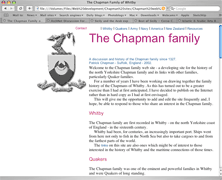
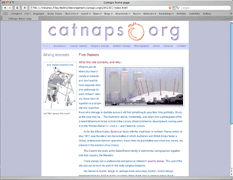
This site was an early attempt to put together in a simple design a range of well-organised information. It contains genealogical information about a particular family, and is mainly text with only a few illustrations to give a little life to the page. It is intended as a resource for those with an interest in this family.
In order to do this I established the site in a similar manner to that of a book or series of books, reflecting the author’s work system and understanding. A splash page establishes an introduction to the family and explains its use to family as well as to researchers with interests in which the family were involved.
Each of the main areas in which the family were involved has a separate page devoted to it and linking to the research work carried out.
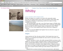
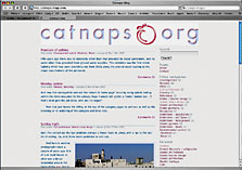
Here the family’s links to an old port in northern Yorkshire is reflected in two photographs, one showing it in its prime when the harbour was filled with working craft, and one showing the beach though this really should be a photograph reflecting tourism, now the main industry of the towm. This principle – of illustrations or photographs contrasting past and present – is used throughout this element of the site and is a useful way of connecting visitors with the purpose of the site.
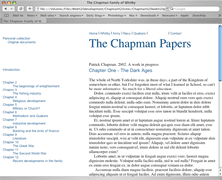
The main element of the site is the large quantity of information produced by the family relating to their history. Much of it has been produced in the form of papers on individuals or aspects of their life assembled with the original purpose of printing for dissemination through the family and to researchers. It is obviously much more sensible to have it placed on the Internet where it can be updated regularly, amending as and where necessary, and where it is accessible to a much wider audience – or, if necessary, restricted to those requiring or asking for access. The particular benefit of placing it on the Internet, apart from it costing less, is the ability to move around the information more readily if it is properly cross-referenced.
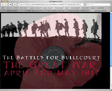
This next site opens with the dreaded splash page, a design element which usually should be avoided. Generally they are a waste of space, requiring an additional click (in this case within the centre of the poppy) to gain access to the information.
Here, however, I deliberately created a splash page in the sombre colours, black and red, together with the two images which are well-known in reference to the First World War: the photograph of British troops against a skyline, and the poppy. Against this is the simple information on the contents of the site – The battles for Bullecourt, The Great War, April and May 1917. The reason for these images and colours was to establish the mood for the site prior to entering.
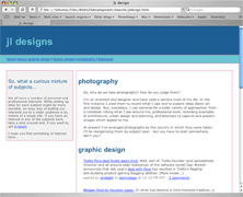
I thought it might be interesting to look at the process I‘ve been through in getting to this stage of site design. This site was one of the first I designed for myself but which I gave up as it was too boring. Bearing in mind that I wanted to show my work as a designer, this was not the way to go. It did, however, give me my first experience in HTML and persuade me that I should spend more time looking around the web to see what seemed to work and what didn’t. What you find doing that, of course, is that although there’s a lot of dross, there is also much better work than your own and more articulate people, particularly some of the bloggers. So, back to the drawing board…
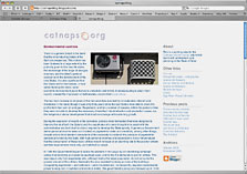
This site was developed from the first specifically in order to introduce a little bit of design illustration but, again, I was unhappy with it. I should add that, at this stage, the site was relatively small; it has grown considerably since then. The illustration itself is too weak as it’s essentially a black and white line drawing and the colour of my name is too bright – the intention having been to show professionalism in the use of the colour blue. Naturally I wasn’t happy with this site, either so, having had a re-think about the nature of what I wanted, I turned to the next design phase and made another mistake in over-designing. Not just that, but introducing elements which did not work properly together.
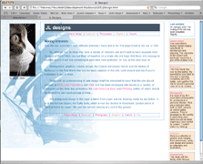
So, this was the next attempt and I have to say that it‘s a bit of a disaster. Actually, a lot of a disaster. Admittedly it‘s the splash page. but there is far too much happening. The cat logo which is intended to be used as the homing button on subsequent pages is unrelated to the rest of the page and the background image doesn‘t fit the page. The five boxes on the right which give a short explanation and act as buttons to the rest of the site also don’t fit. This is a common process for all designers, it’s just that it has taken me a long time to go through this learning process. Anyhow, I realised this was a mess and decided to simplify things.
This was the next stage and, perhaps, the layout I like the best. Unfortunately, try as I might, I could not get it to work across the main platform and browser combinations. In particular I wanted the rollover buttons on the left to remain fixed so that they were available wherever the page had scrolled. It works on my platform and browser of choice, but… I was sure it’s not that difficult for an experienced designer, so I persevered while continuing to write notes which was a mistake in retrospect, and one I’m continuing. The next design was essentially the one shown next below, though I still couldn’t get the menu to stay fixed across different platforms.
So, just for comparison here is the first page of the previous design for this site. Its greatest benefit to my mind was its simplicity of design which, to a large extent, was established by the header.
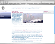
However, before I got this far I continued to try to get the arrangement of a fixed local menu on the left but introduced a horizontal menu for the different subjects of the site across the top. That site is shown below and to the right. The idea is that the fixed menu is always available on any page of the site so, if the mood takes you, other subjects are easy to access and browse.
Try as I might, I couldn’t get this to work as I wanted across the main platforms and without using too many coding workrounds and, as I wasn’t too good at coding, I thought it best to avoid them where I could. So, for some time I stuck to the design above while I attempted, from time to time, to move it towards the design structure I wanted.
In particular I wanted to have a better distinction between the site and local menus, and I also considered using Flash for improved information presentation. This was certainly well outside my capability. The obvious moral is that I should learn to walk before I run…
The next attempt I made to redesign my site was to consider it as a blog. The theory was that this would enable me to post essays that would not have the disadvantage my present site has, that each page tends to read as a long essay when it has not been designed that way. This first site is a freebie I played around with in order to see what I could do with it, but I was unable to to get the tags to work properly in that, when you go to the page for a particular tag, there is no header telling the visitor that the page is composed of articles relating to that particular tag.
The same was true of this second site, Blogger, and appears to be true for all of their sites which makes no sense to me. Of course, I could produce the proper effect on my own site, but I thought this would at least give me a chance to dig into the blog systems out there and take advantage of the vast body of knowledge there is there.
You will see that I designed both these sites to be similar to my existing site so there would be a family feel to them. I have given it up for a bit but will have another go at it once I get a second wind.

I thought I’d add these two studies to this part of the site as it demonstrates something of the concern for the existing site design I have and two possible ways of amending it.
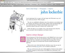
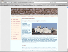
The first thing to say about this study is that it has little to do with Information Architecture and the intrinsic issues of site design. This is not a good thing to admit. I was aware of the problem and thought I would put it off until I had sorted out the design problems. This is solely a graphic issue as I see it. This illustration is of the site as it existed for some time. The first design element was a strong header to give identity to the site. This was coupled with a different coloured background for each of the subjects – in this case sage green for the Islamic pages. This was associated with a lighter sage green for the horizontal and vertical menus, with a darker green for roll-overs and page identification.
Here I looked at two alternative ways of laying out a revised site. Both have a similarity in that they have a white background which is intended to give a more expansive setting for the content. The logo was slightly different, but that wasn’t important here. The horizontal menu was now a dark green to give a strong signature to the site, but the menus generally were down-played.

The first of the two alternatives uses the more common format for blogs by having the menu on the right of the content. It was intended that this would create a more familiar page for viewers. There are two vertical lines to contain the content. It has to be remembered that, when scrolling down the page, the main thing that will be seen is the content – along with any pictures, of course – within those two lines which will give it ‘place’. What I don’t like about it is the relationship with the line on the left, and the way in which the content sits on the left of the page rather than on the right. This is something I have noticed on other sites and which I dislike.

This second development puts the vertical menu on the left which automatically moves the content to the right. You can’t see it here but the text of the vertical menu is in caps – uppercase – but is more lightly coloured than the previous example. While the first alternative has a neutral coloured logo, this is more brightly coloured, an issue that has to be considered in light of the need to have different colours on the different subjects I have on the site.


One of the problems I face is that on one of my subjects, Islamic design, there is so much material that it is getting out of hand. In order to try to deal with the long pages I am writing I thought it might be an idea to see how the site would look if I break down those pages. Here is the first attempt, but without fly-outs for the menu which I think might be longer than the screen height. I have grouped the menu on the right with a sub-menu next to it. Perhaps it would be better to have the sub-menu at the top as in the lower of these two examples.

In the second example the basic menu appears on the left, the side I prefer for menus, and the sub-menus are listed in a box at the top of the content, identified both by colour as well as by being listed in three columns It was anticipated that this would give the optimum space for the sub-pages that I believe are likely to be required. You will notice that there is more space given in the second example, but this has a lot to do with optimal window widths, and I still find it difficult to make a decision on which width to select as well as on line length. Looking at the statistics relating to visitors it is noticeable that there are very few nowadays using an 800px window.
I should also mention that the first of the two illustrations still maintains the colour coding I use for each of the subjects on my site, while the second omits it. This site uses colour to define the different subjects, though those colours have changed slightly. Islamic is green for its religious connotation, Bullecourt red for the relationship with war, graphics a neutral grey and the Cassini family a brown which relates to the colours I recall in Liguria. Photography will be blue, though verging towards grey. Here, to the right, is the site as it now looks for comparison.
The only reason I have put these two illustrations up is to show how different similar material can appear. There is more to be thought about.
The issue of colour and colour coding reminds me that this is a subject to which we should all pay more attention. I have mentioned colour blindness before but it is also important to note that, under the Disability Discrimination Act in the United Kingdom, it is essential to ensure that all viewers are able to have access to what is written.

There is a tendency with most designers to fiddle with their designs rather than get on with the more important work: that associated with the content of their projects, in this case my site. Now I’m working on a new approach to the site. This illustration was sketched on a yellow pad in the middle of a seminar. It’s difficult when an idea comes and you need to record it as quickly as possible. From that sketch I was able to set up a preliminary page to test some of the ideas. There have been two stages in this part of the process; the next few paragraphs illustrate the second stage.


My site is unusual in that it contains a lot of information, mostly in the form of long pages. The Islamic design pages were, in the examples shown above, twenty-two separate pages. However, the continual addition of notes has made some of the pages far too large, taking longer to load. Because of this I have divided some of the pages into three separate pages and, in addition, I have added a few pages. There are likely to be more additions to come as pages are divided again and more added. This page design to the side can be compared directly with the illustration directly above.
Because of the problems associated with the presentation of information, I believe it may be sensible to redesign the site and re-think how the different pages might be best displayed. Here are two illustrations that show a possible approach, a sort of magazine design. Instead of only showing the titles of the pages, I have added a photograph and the beginning of the text for each page, these photographs being used at the top of each subject page to show continuity. I shall probably not go ahead with it as, although it may look more attractive, it means more scrolling for the viewer.
In the lower illustration I have shown the page continuing after the list of pages, but it would probably be more sensible if I had a new page for each subject, though this would mean coming back to the list page before choosing again. The design is created using a ten-columnar grid and should appear more open with a greater proportion of white space, though as yet there is no colour clue to the subjects as there are on the existing pages. This is still developing so will take some time to think through. Decisions, decisions…
There is still one other issue I would like to resolve, and that will influence the site layout. I would like to have sidenotes on each page. Conceptually they would be located on the right of the text to which they would relate, in effect filling a third column which is on yet another design. However, I am having difficulties coding it to work on all browsers, so it might never be effected as it takes me away from other, more pressing, work.


Going back to the first stage in the above progress, these two photographs are of the top and part of the page of the earlier stage of design. It is evident that there are only three columns of photographs compared with five in the later development which means that, as the site has developed more pages, there is further to scroll to see the illustration relating to each page.
Each photograph had the title of the page superimposed on it as an opaque mask, but this tended to make reading more difficult, so it was decided that the combination of having to scroll because of the three columns, together with the difficulty in reading the superimposed page titles, led to this scheme not being adopted.
One feature that was considered is likely to be adopted, and that is adding a translation link on each page. This can be seen centre left on the lower photograph. While many people coming to my pages have English as their first language, many do not and I have noticed that some will translate the pages themselves. Adding this feature to the page is likely to be an advantage to visitors.
However, there is one problem associated with adding the translation link. When other languages are translated, many of them take up more space than their English equivalent. This means that the spacing of elements of the menu, particularly, takes up more space and has a variety of visual effects on design elements of the page. This will have to be considered before adopting the translation button.
This site is not special in any way. It doesn’t sell anything, it’s just a site for semi-academic research notes. Because of this I just wish to keep it relatively clean and simple.
More to be written…
Greeting cards | top | Play